13 elements of a successful landing page (and how to create one)


We’ve all been there — you’re minding your own business, scrolling through your feed when suddenly an ad pops up. You click, and you’re taken to a successful landing page that is clean, well-designed and has just enough information to make you want to learn more. Suddenly, you find yourself handing over your credit card information and making an impulse purchase. What just happened?
You just got won over by a successful landing page.
Do you want to create the same effect for your business? Have customers click on your ad or email message and buy from you immediately? I bet you do.
This post will help you learn everything you need to know about successful landing pages. So, keep reading to learn how to create one that will achieve your goals and grow your business.
What is a landing page?
You might be thinking, what exactly is a landing page?
A landing page is a standalone web page created specifically to increase conversions. It’s where a visitor “lands” when they click on a Google ad, a social media post, or a link in a promotional email.
And the job of a landing page is to get people to stay long enough to take action — whether subscribing to your newsletter, downloading a white paper, or making a purchase.
As you read this post, you’ll learn more about why landing pages matter. And you’ll appreciate what makes them so powerful that you need to treat them differently than you would a normal web page on your site.
How is a landing page different from a web page?
The key difference between a landing page and a web page is that landing pages are designed with one specific goal in mind — to convert visitors into leads or customers.
They’re meant to get people to take a specific action, whether it’s buying something, following your brand on social media, leaving a review, or something else.
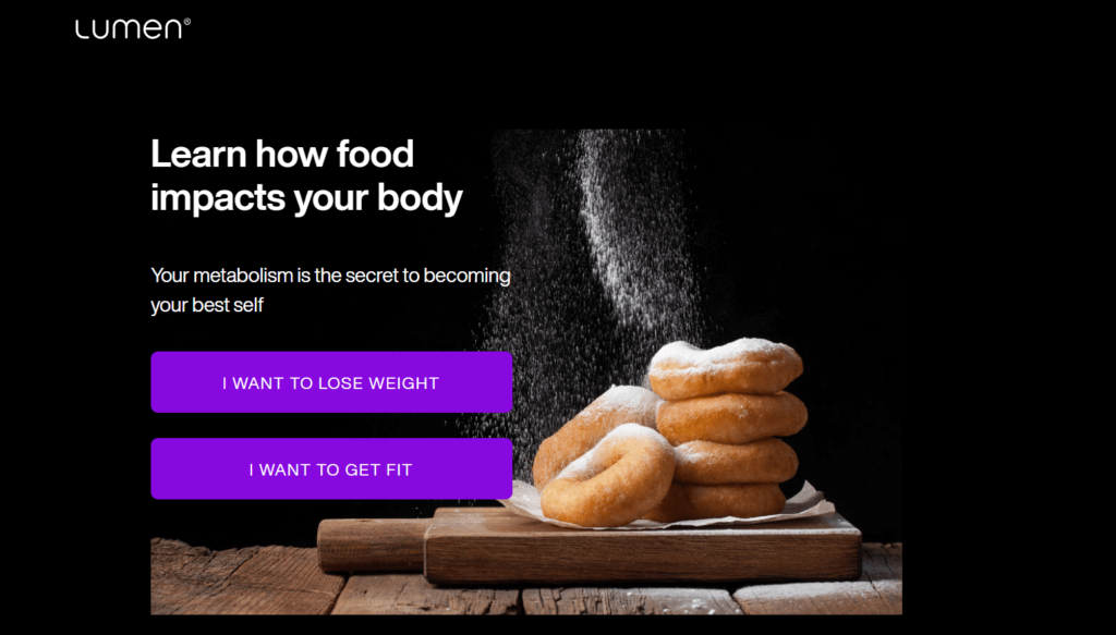
Web pages, however, don’t always compel people to take action. They can serve different purposes — like blog posts that provide information or contact pages that allow customers to reach out to you.
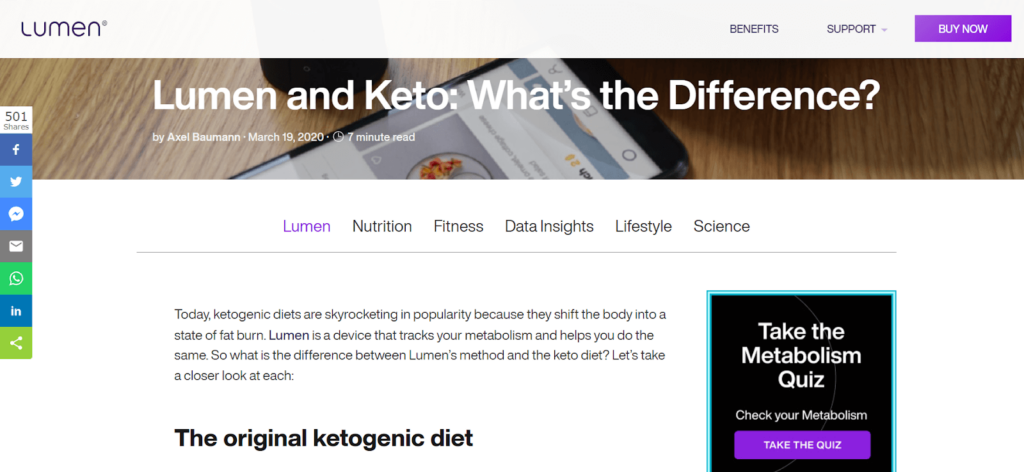
Both landing and web pages are important for your business and can work together. The key is to use each one for its intended purpose and to focus on giving your audience what they need.
How landing pages can grow your business
Landing pages are made to do one thing — get people to take action. And they do this in several creative and exciting ways.
Here’s a breakdown of the different ways successful landing pages can increase leads and conversions. Or achieve other indirect goals to help your business grow.
- If you’re running a Google Ads campaign, you can use a landing page to increase conversions by providing relevant, targeted information that speaks to your ad.
- Launching a new product? Use a landing page to increase awareness and generate excitement.
- If you’d like to grow your email list, a landing page can help you collect leads by offering something in exchange for an email address.
- Use a landing page to build a buzz before the launch of your business
- It’s also a powerful tool if you’re promoting a webinar or live workshop
- Build leads for your sales team
- Collect reviews and testimonials for your business
- Promote a flash sale
- Convince your audience to be part of a meaningful cause
- Get more registrations for an event
- Build a maintenance page when your website is being updated
- Redirect users when they land on a 404 or some other error page
- Thank your users with a thank you page after they buy a product
As you can see, landing pages are versatile and you can use them in many ways. They’re a great way to support your marketing efforts and to keep customers engaged with your brand.
Landing page examples to learn from
What do landing pages look like?
It’s very likely that you’ve been on several landing pages as you’ve searched for products or sought information online. Paying attention to them can help you figure out how they work and what landing pages for your brand should look like.
Let’s take a look at a few examples of landing pages that are doing it right. You’ll learn more about them and figure out how to make them work for you.
SketchWow
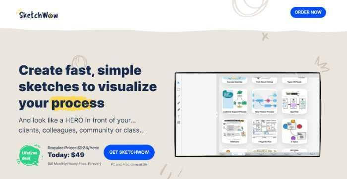
Here’s an example of a graphic design tool called SketchWow.
If you search for it online, you’ll likely find a link to its promotional landing page.
SketchWow’s landing page is attractive, uses consistent brand colors, and has fun graphics that match its offering.
It also includes an animated gif that showcases what it does and how it works. So, people who land on the page know what it’s about in an instant. It also creates a compelling case for why it’s useful to content creators. And it makes an offer for a one-time price that is hard to resist.
Localio.ai
Here’s another landing page to consider — Localio, an AI-writing assistant to generate content.
Included is a video and compelling copy to keep users on the page. Also present are social media testimonials, consistent visuals, and other evidence. Plus, it features a lifetime offer to get people to take action fast.
The next time you come across an ad on Facebook or see an interesting link in your email, click on it and explore the page you land on. It’ll allow you to see how landing pages work and how you can use elements you find interesting.
13 elements of a successful landing page
Your landing page should be designed with conversions in mind. That means including elements like social proof, testimonials, and an easy-to-use form or purchase button. The goal is to make it as easy as possible for visitors to take the desired action.
There are many small but impactful details worth paying attention to. Here’s a list of elements that will improve your landing page and help meet your goals.
1. Keep the User Interface simple
Too much information can be overwhelming and turn visitors away. Stick to the essentials — using whitespace, clear headlines, and easy-to-scan sections.
Making your landing page flow well and focusing on a simple message is important to make every other element work.
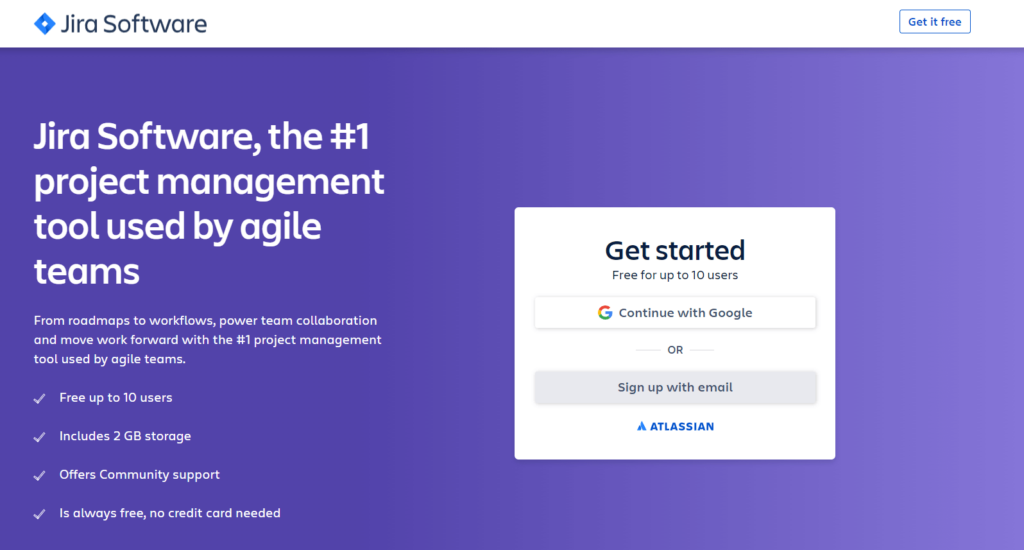
So, make sure you build landing pages with simplicity and clarity from the start. It’s worth hiring a copywriter or a UI designer to help you build a landing page. It’ll create the best impact for your business.
2. Craft a powerful headline
A headline is a sentence or phrase placed at the top of a web page or landing page. It introduces or summarizes the content on a document or website.
On a landing page, the headline is essential for capturing the visitor’s attention and convincing them to stay on the page. Make sure that your headline is short, clear, and to the point. It should be relevant to the offer or product you’re promoting and use persuasive language.
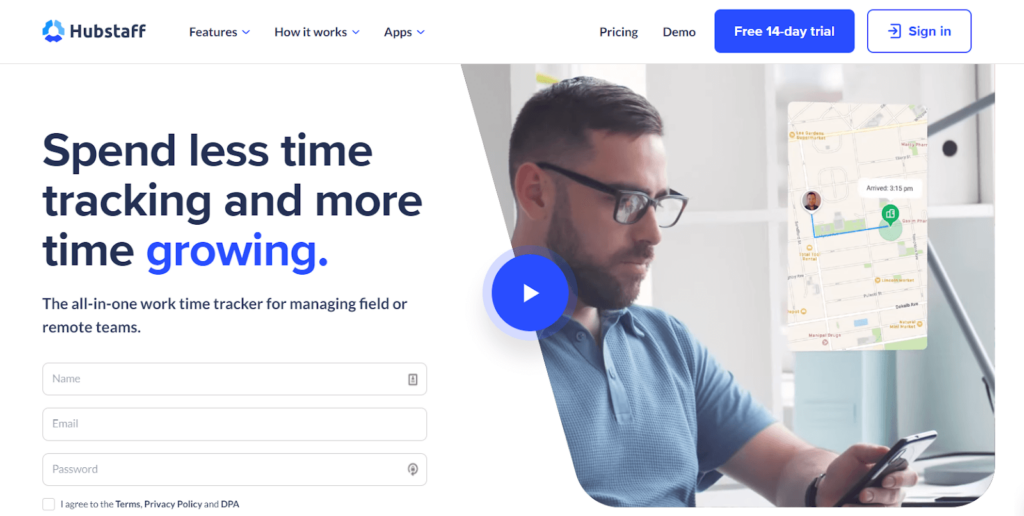
It’s important to use emotional language that hooks readers. Dry statements like “Our product is the best” won’t cut it. Instead, try “Get the relief you deserve with our natural remedy.”
I recommend using a headline analyzer tool to score your headline and ensure it’s as effective as possible. A headline analyzer is a simple tool that scores your headlines or subject lines between 0-100. The higher your score, the better.
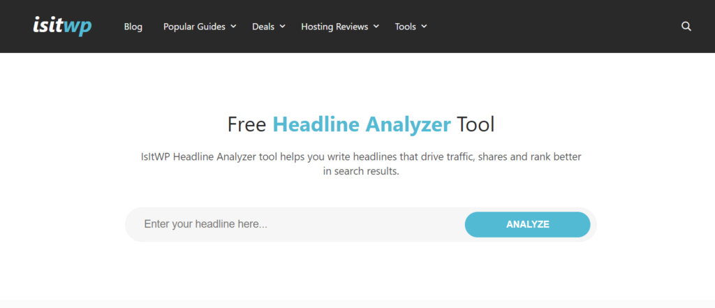
The analyzer looks at factors like word count, sentiment, and the overall structure of your headline to give you a score. It will make suggestions to help you improve it, too.
3. Feature a strong hero image
Top landing pages always feature a strong hero image, usually high quality, with bright colors that stand out. The hero image is the first thing visitors see when they land on your page, so making a good impression is essential.
Pick high-quality images that make people understand the main topic of your landing page. It’s a good idea to include the image of a person in your featured images. This establishes a human connection and helps visitors relate to your message.
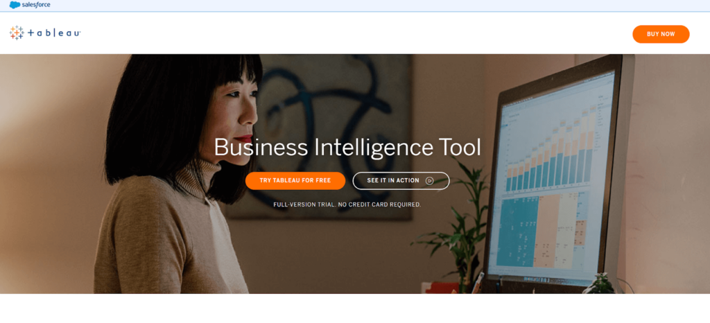
Alternatively, you can create a vibrant graphic for your hero image, giving you the flexibility to have as little or as much detail as you’d like. Work with a designer from freelancing sites to help create an awesome design that keeps people active on your site.
4. Use persuasive copy
Your writing (also known as copy) on your landing page needs to get people to take action. After all, that’s the whole purpose of a landing page. This means applying copywriting principles, and it’s worth considering hiring a professional copywriter to help establish your brand through words.
If you want to write the copy yourself, I recommend reading ‘Web Copy That Sells‘ by Maria Veloso. It’s an older book but has timeless copywriting principles that you can apply today.
Here are some tips to make your landing page copy more effective:
- Focus on the customer’s problem
- Talk about why the customer’s problem still exists
- Explain how things are different such as how there’s new technology, new approaches, or options that can change your audience’s problem
- Talk about your brand and offering that can solve this problem
- Get your user to take action
The copy you use can significantly affect how well your landing page converts. You’ll see it even in minor elements. For example, you can improve a button that just says ‘Click Here’ by saying ‘Grab your Free Report Now’ or similar exciting writing.
5. Add social proof
Social proof is a psychological principle that says people are more likely to do something if they see others doing it. It’s why we’re more likely to buy a product with good reviews. And it’s also why landing pages often feature testimonials from happy customers.
If you’re just starting, it can be difficult to get testimonials. But focus on building a relationship with customers and reaching out to people who seem happy with your products. Make it easy for users to create a testimonial by making a template or giving them guidelines.
If you can’t get a testimonial right now, then focus on adding reviews to your landing page.
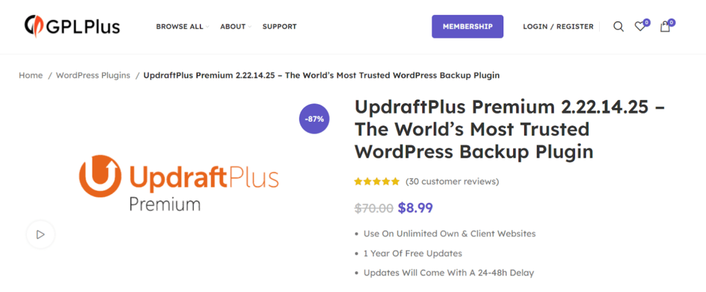
Just the simple step of adding social proof can boost people’s trust in your content. And it’ll make them more willing to buy things from you.
6. Add trust badges
Trust badges are symbols that show your website is safe to use and that your product is high quality.
For example, if you’re selling physical goods, you might include a badge that says ‘Free Shipping’ or ‘100% Satisfaction Guaranteed.’
Badges like these give visitors confidence in your product and make them more likely to buy from you.
You can also get trust badges from authoritative sources. Brands like Stripe, Shopify, and PayPal all offer badges you can add to your website.
Make sure that you meet the standards set up by such brands. Having their trust badges on your site implies that your website is secure, and people can enter their payment details safely on your payment forms.
7. Offer a compelling discount
Offering discounts to customers is an effective way to get people to take action.
Discounts create a sense of urgency, especially if users see that a discount is only available for a limited time. A well-crafted offer or discount can get people to act quickly before it expires.
Additionally, discounts can make users feel like they’re getting a good deal, increasing the likelihood that they’ll make a purchase.
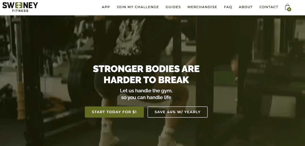
So make sure you add a compelling discount on your landing page. You’ll see a significant increase in how many people convert.
8. Craft compelling calls-to-action
Anyone who’s ever designed a landing page knows that calls to action are critical.
Without a strong call to action, you might as well be playing guessing games with your visitors. What do you want them to do? How will they know what to do?
A good call to action is clear, concise, and impossible to miss. It tells the visitor exactly what you want them to do, and provides a clear path to follow. In other words, it takes the guesswork out of the equation.
Some tips to remember when creating calls to action is to make them descriptive. ‘Join Your Wellness Community’ is more useful and exciting than ‘Sign up’.
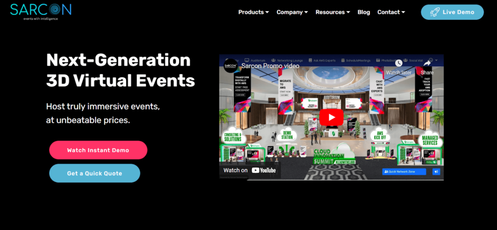
Finally, ensure that colors on your buttons for calls to action contrast and stand out. Such tactics will help drive more engagement. And your conversion rate will thank you for it.
9. Offer powerful guarantees
You know what they say: the proof is in the pudding. Or, in this case, the proof is in the guarantee! If you’re looking to get people to convert to your landing page, one of the most effective things you can do is offer a powerful guarantee that your product or service works.
For example, if you run an advertising agency, you could guarantee that you’ll double the number of leads a client can get. And if you don’t achieve these goals for your client, they’ll get their money back.
Of course, don’t make promises you can’t keep. Think about case studies in your business and big wins you’ve created for clients. These will help you to balance your guarantees so you don’t under or over promise on what you can deliver.
Featuring real and meaningful offers and guarantees on your landing page are a surefire way to get your landing pages to convert.
10. Add an opt-in popup form
Landing pages are important for creating conversions fast. However, sometimes they don’t work as intended. A percentage of people will land on your page and then leave – most likely to never return. In such cases, an opt-in popup form can help to get leads and convert them later.
An opt-in popup is a form that appears on web pages to capture a user’s email and name. You can create one by installing an opt-in popup plugin on your site.
The key is ensuring the popup is targeted and relevant to the page content. Otherwise, it will just be a nuisance that drives potential customers away. You can also offer an extra discount in your popup or a free download to users who submit their emails. In this way, an optin popup can be a powerful tool for getting leads and converting them into customers.
11. Offer a free downloadable or a trial of your services
If you want people to sign up for your services, one effective way to get them to convert is to offer a free downloadable or a trial of your services. For example, if you’re a web design company, you could offer a free eBook on ‘How to choose the right web design company’. Or, if you’re an SEO company, you could offer a free trial of your services.
People are always looking for ways to get more value for their money. And if you can provide that, they’ll be more likely to sign up for your services.
By offering genuine value to prospects, your landing page creates engagement and helps build leads you can nurture over time.
12. Add a live chat tool
Sometimes people need an extra push to take action. And despite how much we rely on electronic communication, we still want to know there are real people behind a website or tool.
Adding a live chat plugin to your landing page gives your users an added element of trust and certainty.
A live chat tool allows people to get answers to their questions in real-time. It also gives you the chance to answer any issues that prevent people from buying things from you.
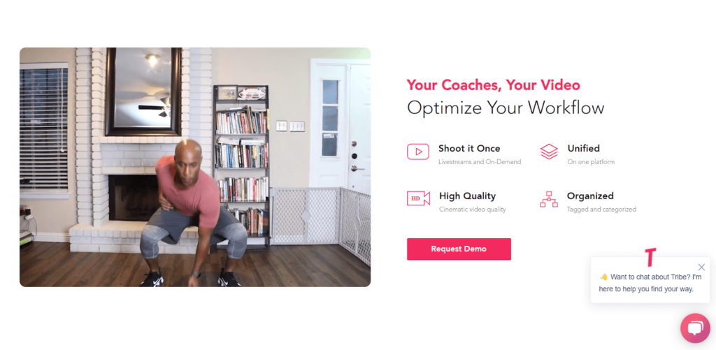
You can even enable your chat support to give a special offer on top of your other bonuses and discounts.
Having real people talk to your audience can significantly boost your conversion rate.
13. Ensure speed and security
If you want your landing page to convert, it needs to load fast. And this can be a challenge, especially if it’s heavy with text, images, and videos. Building your website and landing pages on a reliable hosting platform that offers speed and security is critical.
Choose a hosting platform like EasyWP. It’s specially designed for WordPress websites and the fastest managed WordPress hosting in the market.
Remember, people leave a website if it doesn’t load in under 3 seconds. And if you’re spending money on ads, your image and text-heavy landing page need to load fast and make an impression.
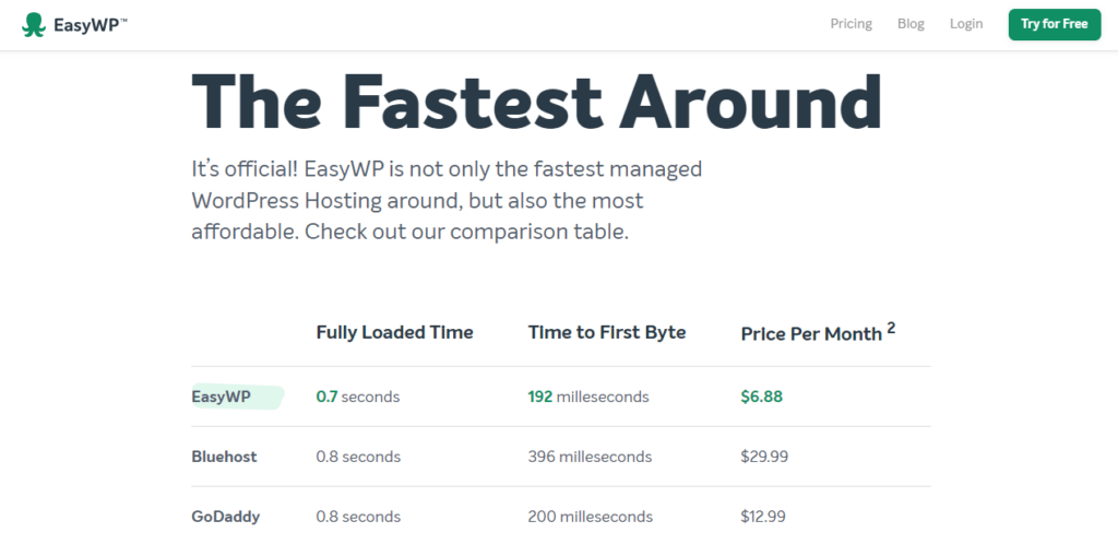
So, don’t forget to make a solid hosting platform like EasyWP the foundation of your business.
Now that you’re aware of some of the key elements of a successful landing page, it’s time to put them into action and create a landing page that converts.
The right tool to create a landing page
You don’t have to be an experienced designer to build a high-converting landing page — all you need is the right set of tools.
Today, DIY landing page builders make it easy to create beautiful and effective landing pages without any design or coding skills.
Try a drag-and-drop website builder like SeedProd. It has several free templates for any purpose. All you need to do is install it on your WordPress site and follow its in-site guide. Tweak a few details like the text, images, and colors, and you’re on the way to building a landing page.
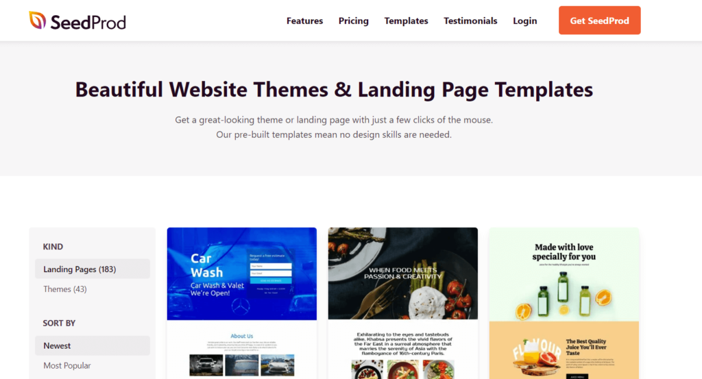
With a tool like SeedProd, you can build gorgeous landing pages fast.
Choosing the right tool is critical. And with a solid WordPress plugin, you can add a countdown timer, integrate with email marketing service providers, and more.
Gain ROI with a well-designed landing page
The ultimate goal of any business is driving sales. Especially when you’re spending money on ads and other marketing efforts. You need to see a return on investment (ROI). And this is where a well-designed landing page comes into play.
I’ve laid out several tips you can work with to create a successful landing page. However, you must also test your landing page elements to see what works for your audience. Remember to carry out A/B testing on different aspects of your landing page, like the headline, calls to action, images, and other features.
Small improvements can significantly boost how well your landing pages perform.
Are you ready to boost sales and propel your business to the next level? Start creating landing pages that convert.

Guest Contributor: Syed Balkhi
Syed Balkhi is on a mission to level the playing field for small businesses. 20+ million websites use his software to grow and compete with the big guys. 100+ million people read his blogs yearly to grow their website traffic, sales, and conversions.

