This week in WordPress design — trends, CSS gradients, and a new theme from Automattic


In the fast-paced digital world, your brand’s online presence hinges largely on your web design. The perfect blend of innovation and relevance in design not only entices your target audience but mirrors your brand’s ethos. In this week’s WordPress design roundup, we delve into the top web design trends for 2023, explore the visual charm of CSS background gradients, and introduce you to ‘Hey,’ a minimalist WordPress block theme tailor-made for bloggers.
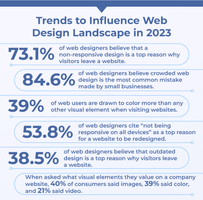
Biggest trends influence web design in 2023
As many of our readers know, web design plays an essential role in representing your brand in the digital age. Not only does a good design capture your target audience’s attention, but it also reflects the brand’s values and style. Understanding your audience and their preferences is key to creating a relevant and appealing website design.

Image source: GoodFirms
In a recent post by review and rating platform GoodFirms, several award-winning web design features expected to dominate 2023 include:
- Parallax scrolling. Creating a 3D effect as the user scrolls, and different elements of the site move at varying speeds
- Micro-animations. Small, responsive features that engage user attention
- Witticism. The use of concise, clever taglines to convey messages instead of heavy text
30+ modern, stylish CSS background gradients
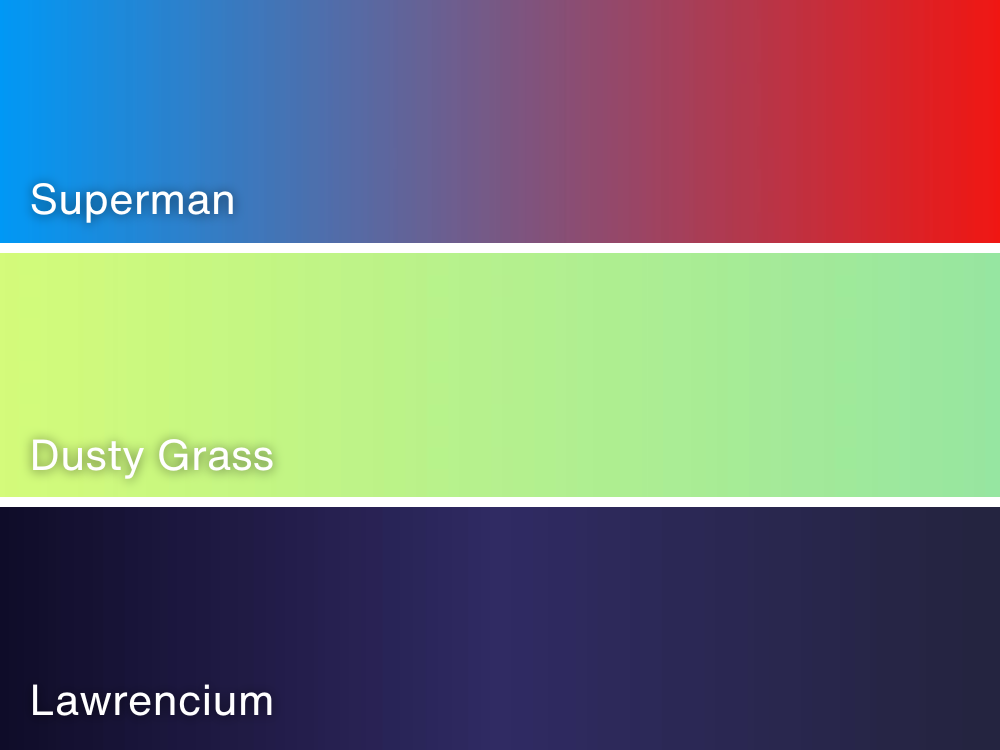
Staying up-to-date with web design trends and standards is crucial for designers and developers. Currently, background gradients are widely used in modern websites. CSS gradients offer better control and performance compared to using image files. MakeUseOf recently published a round-up of more than thirty beautiful CSS gradient examples.
There are three types of gradients: linear, radial, and conic. These can be created using the linear-gradient(), radial-gradient(), and conic-gradient() functions, respectively. Additionally, repeating gradients can be achieved with the repeating-linear-gradient(), repeating-radial-gradient(), and repeating-conic-gradient() functions. Each function creates an image that consists of a progressive transition between two or more colors.

Image source: MakeUseOf
By incorporating these background gradients into your CSS design, you can create visually appealing websites that stand out.
A new, super-simple WordPress Block Theme for bloggers
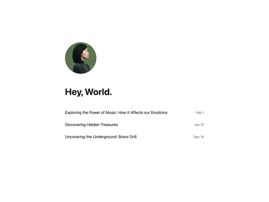
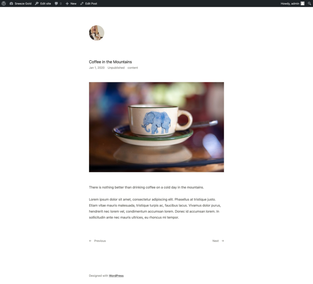
Hey is a block theme designed by Automattic for WordPress users. Originally designed for WordPress.com users, it’s now available to everyone who uses WordPress. It offers a simple and clean design, making it easy to start writing online without the need for extensive customization. The homepage design features a profile image, site title, and recent posts. Single posts display with a feature image at the top, and navigation options are available for previous and next posts. Users can also add menu items, but clicking the site logo will bring visitors back home. The Hey theme comes in two styles – default and serif – and colors can be adjusted for a more vibrant palette.

Image source: WP Tavern
However, one drawback of the theme is that if users want to display more than the three most recent posts, they will need to add the pagination block inside the query loop block. This requires some styling adjustments to match the theme better. Despite this, Hey also includes templates for WooCommerce compatibility, allowing WordPress.com users to quickly set up a store.

Image source: WP Tavern
Overall, Hey is an elegant block theme design that offers ample white space and a distraction-free reading experience. It is suitable for those who want a blank slate to start with or prefer a theme that prioritizes writing above all else.
We hope you found this read enjoyable and informative. If so, we encourage you to explore other editions of our weekly WordPress design roundup. Each edition features the latest trends, tips, and inspiration for designing a stunning WordPress website. Happy designing!
