Color theory in web design: how to choose the perfect color scheme for your website


Color makes up 80% of brand recognition. And up to 90% of a consumer’s initial impression of your brand comes from color.
It makes sense. Color is one of the first things people see when they visit your brand’s website.
That’s why it’s so important to choose the right color scheme. Doing so helps you create a memorable web experience that resonates with your target audience.
Sure, it’s okay to have fun and add a bit of creativity as you design your site. But think strategically about the colors to incorporate into your website’s design.
What is color theory, and why is it important in web design?
Color theory explains how we perceive color and how it affects our emotions (color psychology). Think of it as the science and art of using color.
You might choose colors that you think look good together. You might experiment with different color harmonies to create visually appealing compositions. That’s the artistic part of color theory. The scientific aspect is how colors appear to us. Factors like light intensity, surrounding colors, and individual differences in color vision influence human perception of color.
The other scientific aspect of color theory is how colors affect us. Warm colors like red and yellow are energizing, while cool colors like blue and green can evoke feelings of calmness.
Now that you understand color theory, you might wonder why it’s so important in web design.
Here are just a few reasons:
- Aesthetic appeal –Color sets a website’s tone and mood. It can evoke emotions, convey brand personality, and create visual interest.
- Brand identity –Consistently using your brand colors across your website can reinforce brand recognition and foster a strong brand image.
- Navigation and usability – Using distinct colors for links, buttons, and navigation menus can help users quickly identify interactive elements and navigate your website.
- Accessibility – Using contrasting colors between text and background elements improves readability, especially for users with visual impairments
- Visual hierarchy – You can use color to establish a visual hierarchy and prioritize content. For example, using different colors for headings, subheadings, and body text can guide users’ attention and emphasize key information.
FedEx is well-known for its purple, orange, and white color scheme. Here’s a look at its website.

Notice how it strategically uses color throughout the landing page to align with its brand values and enhance the user experience.
The call-to-action (CTA) button, “Track,” is orange. The bright color draws the eye towards it so visitors know exactly what to click to track their package.
Choosing the right color scheme for your website
Below, we list some tips to help you pick the best colors for your site design.
Look at different color schemes
There are several types of color schemes. Knowing them will help determine which ones work best for your brand and website.
- Monochromatic – Using variations of a single hue (3 different shades of blue)
- Complementary – Using colors opposite each other on the color wheel (red and green)
- Split-complementary – Choosing a base color and two colors adjacent to its complementary color (blue as a base color and pairing it with yellow-orange and yellow-green)
- Analogous – Choosing colors that are adjacent to each other on the color wheel (blue, green, and teal)
- Triadic – Choosing three colors evenly spaced around the color wheel (red, yellow, and blue)
- Tetradic – Using two sets of complementary colors (blue and orange, red and green)
- Neutral – Using neutral colors like black, white, gray, and brown (white and black)
As you learn the different color schemes, consider the look you’re going for. For a more cohesive design, try monochromatic.
Choose analogous colors to create a sense of harmony and achieve more variety than a monochromatic color scheme.
Complementary, triadic, and tetradic colors create a strong contrast and make colors pop, while neutral schemes create a clean, minimalist look.
Get to know color theory
Color theory is a pretty broad topic, so take your time to study the different elements:
- Color wheel – The color wheel consists of primary colors (red, blue, yellow), secondary colors (orange, green, purple), and tertiary colors that result from mixing primary and secondary colors (blue-green, red-orange, blue-violet).
- Color properties – It’s also a good idea to understand the different color properties, such as hue (pure color), saturation (intensity), and value (lightness)
- Color harmony – Color harmony is what you achieve when you combine colors visually pleasingly.
- Psychology of colors – Colors can create emotional responses in viewers, influencing perception, behavior, and attitudes.
- Red: Passion, energy, excitement, power, hunger, danger
- Orange: Enthusiasm, vitality, warmth, playfulness, hunger
- Yellow: Happiness, optimism, warmth, energy, creativity
- Green: Nature, growth, harmony, renewal, health
- Blue: Calmness, serenity, trust, intelligence
- Purple: Royalty, luxury, mystery, spirituality
- Pink: Romance, femininity, compassion, nurturing
- Black: Sophistication, elegance, mystery, power
- White: Purity, innocence, simplicity, cleanliness, freshness
- Gray: Neutrality, balance, practicality, timelessness
- Brown: Stability, reliability, earthiness, security
- Gold: Wealth, success, luxury, prestige, glamour
- Silver: Modernity, sophistication, elegance, futurism, high-tech
Mercedes Benz uses silver in its branding, website, and logo. The color symbolizes sophistication and elegance, reflecting the luxury and high-quality engineering associated with the brand.

Use your brand colors
To create a consistent brand image throughout multiple channels, include your brand’s colors on your website.
Otherwise, if a potential customer sees one color scheme on your business card, social media page, ads, or other channels but sees a different color scheme on your site, they might think they have the wrong company.
This isn’t to say that you can’t get creative with your site’s design, but just make sure you include at least one or two colors that call back to your branding.
HubSpot does this pretty well with its blog, even incorporating the color orange into its imagery and graphics.

However, it adds a bit of fun by using different colors, such as purple, green, yellow, and black, as the background color for its featured images.

Consider your industry
Brands often choose their color scheme based on their industry. For example, in the fast food industry, many businesses use red and yellow, as people associate them with hunger.
McDonald’s, Burger King, KFC, Wendy’s, and In-N-Out-Burger are examples of fast food restaurants that use red or yellow in their branding and website design.
In the healthcare industry, blue is commonly used to symbolize trust, stability, calmness, and serenity. This is key for reassuring patients and making them feel comfortable.
You can think about the colors you would use for a medical website or the colors you would use for a job board, but what if you are creating a website that falls into both categories? For a case like this, you would need to choose colors that evoke confidence and formality, so blues and greens could work very well.

Fusion Medical Staffing has found the perfect balance between blues and greens and achieved a color combination that perfectly represents its brand. Whenever travel nurses check the site looking for a new job, they can feel safe knowing that the company is serious and trustworthy.

However, creating a site for the healthcare industry doesn’t limit you to the blues and greens.
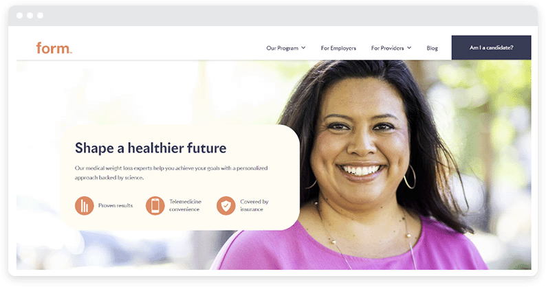
You can play with other colors but also add some depth to give them a tone that looks as reliable as blues and greens. Form Health is another health website that has decided to use oranges and yellows (in a more pastel hue).

This comes in handy when advertising weight loss medications like Wegovy since it’s a sensitive topic for many. In these instances, it helps to reflect optimism and joy so that those who read about Wegovy feel hopeful about the medication and the Form program.

Implement colors to guide navigation
A well-chosen color scheme can guide a user’s journey through a website and communicate the functionality of different tools within a platform.
For instance, consider this HRIS (Human Resource Information System) software page. It requires a user-friendly interface with a carefully selected color scheme; in this case, blue and burgundy are the dominant colors.
The goal is to ensure easy navigation and usage, especially for such a specialized product.

The colors used here could intuitively differentiate between various modules and features, such as payroll, training, and talent acquisition, without losing a pleasant visual presentation.
Thus, the principles of color theory in web design extend beyond aesthetics, playing a crucial role in enhancing user interaction and experience, even in seemingly complex products like this.
Leverage the power of color in your next web design project
Believe it or not, the colors you choose for your website can really shape the way consumers perceive your brand.
The key is choosing a stunning color combination that perfectly balances vibrancy and minimalism. So, choose a color scheme that makes your brand stand out but still appeals to a wide audience.
Need help achieving the perfect design that your audience can’t resist? Use WordPress responsive themes and plugins to make designing a breeze.
About the author
Guillaume is a digital marketer focused on handling the outreach strategy at uSERP and content management at Wordable. Outside of work, he enjoys his expat life in sunny Mexico, reading books, wandering around, and catching the latest shows on TV.
