A-Z guide to creating a single-page website that converts


A common misconception is that you need multiple pages to engage your target audience and grow your conversions. Sometimes, embracing minimalism is the best strategy to offer an optimal user experience and generate more revenue through your platform.
It’ll be much easier for visitors to navigate relevant information on a single-page website than finding answers to their questions scattered across different pages. A well-designed, single-page website is easy to navigate. So, it helps you convince visitors to consider the intended action effortlessly, compared to a website that overwhelms them with abundant information.
This guide educates you on creating an interactive single-page website that fuels your conversions. So, without further ado, let’s start.

Benefits of creating a single-page website
Before diving into the process of creating a highly engaging single-page website, let’s talk about a few of its benefits first.
Easy management
Managing a single-page website is much simpler than one with countless pages. Optimizing a single page makes it easier to offer a seamless user experience to your visitors. Furthermore, you can easily detect and solve problems preventing you from engaging the intended audience.
Even keeping your content up-to-date becomes hassle-free, as you don’t have to explore multiple pages for quick updates.
Effortless information navigation
Single-page websites are generally mobile-friendly, compatible with different screen sizes, and offer a seamless navigation experience on other browsers. So, you can easily cast a wider net and attract visitors with diverse preferences.
Furthermore, visitors don’t have to explore multiple pages to find answers to their questions. The information they seek is readily available. This makes them satisfied with the experience you offer, and they may keep coming back to you for the required information.
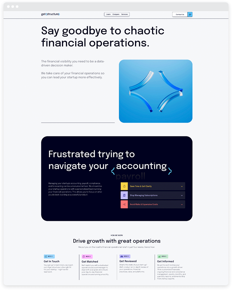
Get Structure is a financial operations solutions provider that serves as an excellent example, showcasing all it offers on a single page.
Hassle-free audience engagement
A single-page website makes it convenient for visitors to find the information they seek. They don’t feel overwhelmed due to the abundance of pages and are less likely to be distracted. Plus, you can easily convey a message tailored to the needs or preferences of your target audience.
Since all the information that your visitors may be interested in exploring is accessible on a single page, they are less likely to leave your website without considering the intended action.
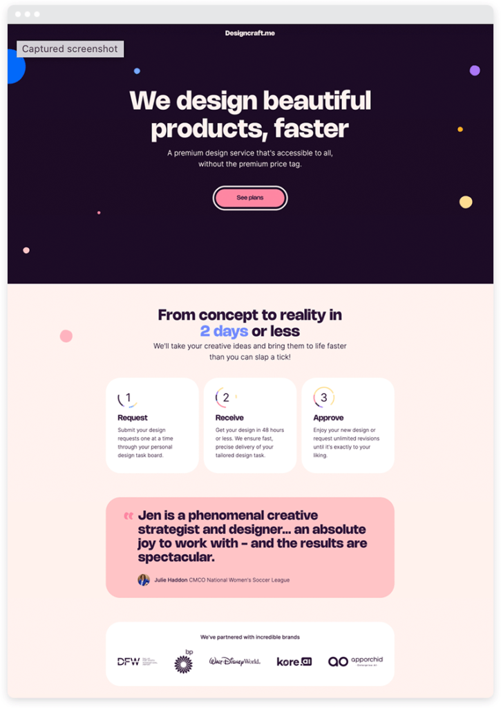
To improve engagement on your single-page website, you can take inspiration from Design Craft, as the website makes all necessary information available through a single page.
Optimal load time
The load time of your website significantly impacts on your ability to engage your target audience. A 1-second delay may lead to a drop in page views by up to 11% and cause your conversions to go down by around 7%.
Generally, single-page websites load faster compared to websites that have multiple pages. So, it’s easy for you to offer a seamless experience to your visitors. Even if you’re grappling with poor load time, identifying the things that cause it and fixing them is much easier, as you don’t have to explore different pages.
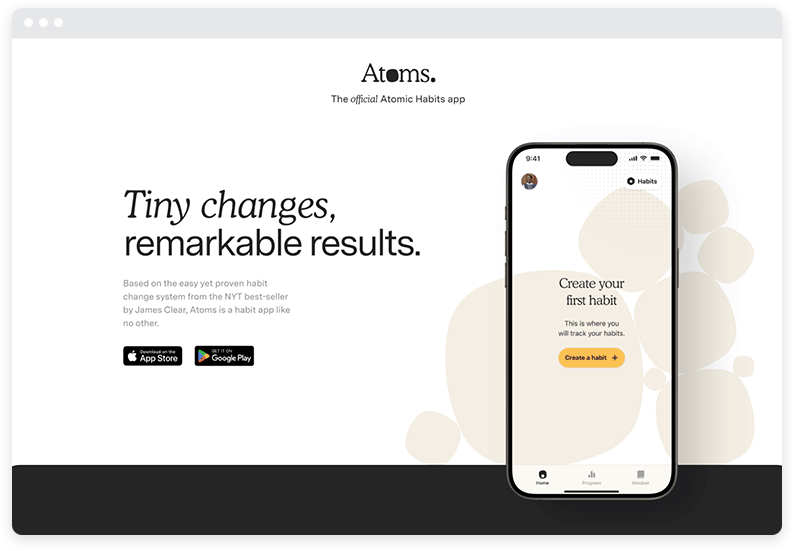
Atoms is an excellent example of a single-page website with a minimalistic design. The page loads within a few seconds and makes all important information readily available.
Effortless optimization
As said earlier, identifying and fixing issues on a single-page website is hassle-free, allowing you to engage your visitors effortlessly. You can optimize your website’s performance, navigation, content structure, internal linking, keyword density, and images with minimal effort compared to a website with multiple pages.
As a result, you can offer an enhanced user experience to your visitors, which complements your online visibility.
High conversion
By having just a single page, you are successfully removing unnecessary steps that your visitors may have to take to find answers to their questions. Creating a single-page website, hence, is best suited when your product or service doesn’t offer complex functionalities. It’s a straightforward solution that helps the intended audience solve a particular problem—for example, a digital whiteboard app.
All relevant information is accessible through a single page. So, you’re saving your visitors multiple clicks to find fitting solutions. This helps create a compelling call to action and ensures a high conversion rate.
This design is particularly effective for impatient target audiences that demand quick and easy information access. On the other hand, it works wonders when your target audience shows a commercial or transactional intent, boosting your chances to convert your visitors.
How to create a single-page website
Now that we’ve covered the benefits of a single-page website, let’s discuss how you can create one.
Chose a niche
Selecting a fitting niche is the prerequisite for creating an interactive single-page website. A niche encompasses an audience segment with certain interests or characteristics that dictate their buying decisions.
Selecting a niche is an essential step, as it gives you a clear idea of the audience to whom you are pitching your solutions. This helps you deploy efficient strategies to engage a relevant audience and promote your solutions in front of the right people.
Know your audience
It’s best to get acquainted with the needs and preferences of your target audience before creating a website. What piques the interest of the intended audience should fuel your content marketing strategy and dictate the type of information you choose to make available through your platform.
Knowing your audience is of critical importance when you strive to create a single-page website. People just visit a single page and decide whether or not the solutions you offer are best suited for them. So, it’s essential to know what makes them tick.
Being familiar with your visitors’ interests allows you to tailor your message, meeting their expectations and offering a customer-centric user experience.
Set clear goals
You should set clear goals before creating a single-page website. You should have a clear idea of your destination to be able to come up with a roadmap to get there.
A single-page website facilitates diverse use cases. You can make money online by adding a paywall to your content, monetizing your blog, promoting affiliate solutions, or providing a B2B SaaS product. You should choose a business model that aligns with your interests and identify the goals you wish to achieve down the road.
This helps you keep your eye on the ball and devise stellar strategies to build a successful business from the ground up.
Purchase a domain
Once you have set clear goals, the next step is securing a domain for your single-page website. And finding one may not be as easy as it sounds. You can’t just go with any domain name that is easily available.
The best course of action here is to choose one that aligns with what you do or the solutions you offer through your platform.
Going for a single-word domain is a viable strategy. However, such domains aren’t easily available. So, just pick a short one that resonates with your operations.
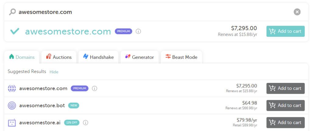
You should also prefer a ‘.com’ domain over other alternatives. A ‘.com’ is easy to remember, has a high resale value, and complements your search engine visibility.
Choose reliable hosting
Once you’ve purchased a domain, the next step is selecting a reliable hosting service provider for your single-page website. A common mistake many entrepreneurs or website owners make when getting started is to settle for a subpar hosting service just to save some money.
A poor hosting service may severely affect the performance of your website and the user experience you offer to your visitors. It may affect your capability to engage your target audience and generate quality leads for the sales funnel.
So, always choose a reliable hosting service provider.
Create a structure
Defining the structure of your single-page website is important. All the information you want your visitors to explore is available on just one page. So, you need to ensure that your content is easy to navigate.
You need to come up with an interactive design for your website with systematic section placement. The core objective here is to engage your target audience and encourage your visitors to consider the solutions you offer.
The goal here is to design an intuitive user interface, facilitating easy access to relevant information.
Choose a responsive theme
Once you have created your website’s structure, get started with creating a responsive website by selecting a fitting theme. You can select a free theme or choose from premium alternatives. However, do not compromise on your website’s visual appeal.
The visual appeal of your website helps you get more eyeballs and makes it easier for you to engage your target audience. Furthermore, you should ensure that your theme of choice is compatible with different screen sizes and offers a seamless experience on all types of devices.
Use an attention-grabbing header
Your visitors’ first impression of your website often dictates their buying decision. If they’re impressed, they’ll likely stay and keep exploring the information published. If not, they’ll simply leave and likely never return.
Hence, it’s essential to have an attention-grabbing header that catches the eye of your visitors and makes a lasting first impression.
The significance of a carefully crafted header is even greater when you have a single-page website. It’s literally a make-or-break situation for you. Either you’ll be able to impress your visitors or lose them for good.
A well-crafted header paired with a high-quality hero image encourages your visitors to keep scrolling and explore the information published. As a result, your visitors will be more likely to consider the solutions that you offer.
Add the necessary information
Now, it’s time to tailor your content to the interests and preferences of your target audience. Your goal is to answer the questions in your visitors’ minds and help them find fitting solutions to their problems.
Optimizing your content to match the queries of the intended audience can help foster engagement and increase the number of returning visitors to your website.
Catering to your audience’s needs helps you cultivate thought leadership, which improves your search engine visibility and helps you generate more traction organically.
Since you’re creating a single-page website, the message you convey should be clear and straightforward. Information clutter can have a devastating impact on your ability to engage the intended audience and generate quality leads.
Ensure effortless navigation
Just because you have a single-page website doesn’t mean that your internal linking structure isn’t relevant anymore. It’s not just the number of pages you have that may overwhelm your visitors. The abundance of information published on a single page may have a similar effect.
To encourage intuitive scrolling and make it easier for your visitors to explore the information published, you should leverage internal links to connect different sections of the page. This allows visitors to jump from one section to another by simply clicking a particular link rather than scrolling all the way through.
A well-thought-out linking strategy facilitates easy information navigation, which greatly enhances the user experience.
Add a robust call-to-action
A clear and compelling call to action dictates your ability to score high conversions through a single-page website. A call-to-action is a visual cue that directs your visitors to useful information or solutions that can help them achieve their goals.
Your call-to-action should be clear and visually-pleasing. Furthermore, its placement matters and plays a critical role in scoring more conversions for you. It’s best that you add a call-to-action at the start of your website. But adding only a single CTA isn’t mandatory.
You can place multiple CTAs strategically throughout the page and try persuading your visitors whenever possible.
Just try not to overdo it because your website has only a single page, so an overwhelming number of CTAs may end up annoying your visitors. Instead, add them only in sections where they serve as an excellent trigger.
Leverage social proof
People are often skeptical when it comes to purchasing from brands or websites they are not familiar with. There may be different reasons causing this behavior.
They may fear potential scams or be unwilling to make poor buying decisions. Hence, they want to know about the quality of the products or services offered by a particular brand.
For this, they rely on the reviews and recommendations of other customers before purchasing anything online.
So, when creating a single-page website, you should always consider leveraging social proof and publishing reviews or testimonials of your happy customers.
Social proof encourages your potential customers to try the solutions you offer with confidence, seeing how satisfied others are with their experiences. Publishing reviews from satisfied customers on your website improves your conversion rate by up to 20%.
The problem is that customers rarely share reviews on their own. So, you should reach out to your customers and ask them to share their experiences. Strategically placing the reviews or testimonials may help you grow conversions and generate more revenue.
You’re all set to create a highly-converting site
This guide shows how you can create a single-page website that converts and helps you generate revenue by leveraging your preferred business model. It’s easy to manage and allows you to engage your audience by facilitating their access to relevant information hassle-free.
With a single-page website, you can offer a positive experience to your current and potential customers, which fuels your authority and complements your online presence.

