9 effective landing page testing ideas to check out


You’ve put a lot of work into building your website, but is your landing page converting visitors as effectively as you’d like?
If not, testing your landing pages is your key to success. We’ve found that by experimenting with different elements on your page, you can identify what resonates best with your target audience and encourage them to take action.
This strategy works for business owners and marketers across all industries. If you have a landing page, you will benefit from testing.
Today, we are going to take a look at effective landing page elements you should start testing. With enough fine-tuning and patience, you’ll be on your way to growing your lead list and turning more people into customers.
Let’s begin!
Experiment with headlines
Your headline is the first thing visitors see on your page, so it needs to make a strong first impression. A clear and compelling headline will capture their attention and encourage them to keep reading.
There are a ton of different ways you can test your headlines. You could experiment with variations. Here are a few examples:
- Use numbers or statistics (“5 Simple Ways to Grow Your Business”).
- Create a sense of urgency (“Limited-Time Offer: Get 50% Off!”).
- Highlight the key benefit of your offer (“Double Your Productivity with (Product)”).
We found that even small changes to your headline can significantly impact your conversion rate. With the right tools, you can also test your headlines for readability and improve them before they’re on your landing page, so you’re using the best version for your live test.
Here are a few more ways you can tweak your headlines:
- Keep it concise: Aim for 10 words or less to ensure your message is quickly understood.
- Use power words: Incorporate words that evoke emotion or curiosity, such as “exclusive,” “revolutionary,” or “discover.”
- Ask a question: Engage your audience by posing a question they want answered.
- Address pain points: Directly speak to your visitors’ challenges or desires.
Reduce loading times
If your landing page takes too long to load, visitors are likely to leave before they even see your offer. This one setback can significantly impact your conversion rates and ultimately hurt your bottom line.
The amount of sales and traffic you could lose due to a slow site is quite shocking. Research shows that after 2 seconds, you lose 7% of conversions, and this number keeps getting higher every second.
There are several ways you can reduce loading times and boost customer satisfaction.
First, let’s talk about caching. Caching creates temporary storage of your web pages, which allows them to load quickly for repeat visitors. This process reduces the workload on your server and significantly speeds up page loading times. Many content management systems (CMS) offer caching plugins or built-in caching features that you can turn on and customize to fit your needs.
You’ll also want to make sure your images are optimized and videos are hosted off-site. For this, you’ll need to compress images to reduce their file size while making sure your audience can see and enjoy them. Lazy loading can also help with images. Essentially, this delays the loading of images that are off-screen when your visitor scrolls down.
If you’ve addressed these factors and still need a faster website, consider upgrading to a faster hosting provider. Your hosting company can have a massive impact on your site’s speed and performance.
You don’t want to skip this testing step because loading times will have a direct impact on your success.
Test for mobile responsiveness
With 60%of internet access now taking place on mobile devices , it’s hard to overstate how important it is to optimize your landing pages for mobile users. A responsive website will automatically adjust its layout and content to fit any screen size, which ensures a positive and user-friendly experience, regardless of how people choose to check out your website.
Karina Egle from all-in-one ecommerce platform Whop says that the design process nowadays has to be focused on a mobile-first approach. This strategy is essential because the majority of users interact with websites and applications primarily through their mobile devices. By prioritizing mobile design, businesses can ensure a seamless user experience, leading to higher engagement and conversion rates. It also encourages simplicity and clarity, which can benefit the overall user experience across all platforms.
While most modern WordPress themes are designed with mobile responsiveness in mind, it’s crucial to preview your landing page on various devices to confirm everything looks good and functions correctly. Pay close attention to button and link sizes. Make sure they are large enough to tap easily.
You’ll also need to test all forms and interactive elements to guarantee they are easy to use on smaller screens. The last thing you want is to try to create interactive content only to find that over half of your audience can’t use it.
Another thing you’ll want to do is create a menu specifically for mobile users. Desktop folks can easily click around and find what they need, it’s a bit harder for people on smartphones. So, test a few different menus and find out what people like best. This step will help you keep people on your site once they hit your landing page.

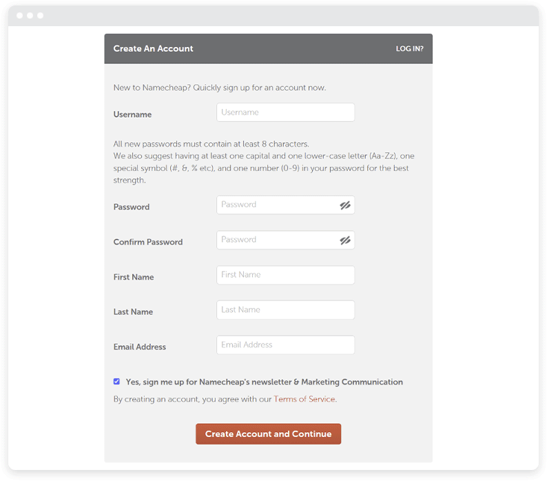
Tweak forms and fields
If you own a website, you already know how important forms are for your landing pages. You need them to grow your email list, collect payment information, encourage event registrations, host giveaways, and so much more. However, a long and complex form can actually discourage people from completing it.
To maximize your conversion rate, make it a goal to strive for a balance between gathering sufficient information and making the process as user-friendly as possible.
My first piece of advice is to only ask for essential information. If a customer is considering buying your email marketing solution, for example, they may get discouraged if you ask for their phone number before they pay.
This information could be requested after they complete their profile, but at this particular phase, there’s no reason to ask for their phone number.
Additionally, use clear and concise labels so visitors understand what information you need. Experiment with different form lengths. Shorter forms are generally more effective for simple offers, while longer forms might be necessary when you require more detailed information.
We also suggest trying conditional logic on your forms. Simply put, this means the forms will change based on what the user selects in a previous field. For example, an email marketing SaaS might adjust their signup fields based on whether their client is B2B or B2C.
Here are a few more rapid-fire tips to consider when testing your forms:
- Use inline form validation to provide real-time feedback on user input.
- Implement auto-fill functionality to save time for returning visitors.
- Group related fields together for better organization.
- Use progress indicators for multi-step forms to show users how far along they are.
- Offer alternative signup methods, such as social media login options.
Adjust your value proposition
By now, you know that your value proposition is essentially a statement that explains how your product or service solves a specific problem or adds to the quality of life. It should clearly highlight the unique benefits of choosing you over the competition.
The problem many business owners face is they become emotionally connected with one value proposition and don’t really experiment with it. They are actually doing themselves — and their customers — a disservice.
Tweaking your value proposition could help you reach your audience in ways that simply weren’t possible before. For instance, a coming-soon page builder would never get the opportunity to expand and become a fully-featured website builder without a little experimenting.
If you’re thinking of trying different value propositions, focus on the benefits rather than features without context.
Here’s an example that shows how expanding on your proposition can help. Instead of simply stating, “Our software has advanced reporting features,” explain how this feature benefits the user directly, like this: “Make smarter business decisions with our in-depth reporting and analytics tools.”
The second message will connect better with your audience because they can clearly see what they stand to gain by trying your product.
Don’t be afraid to test your value proposition across multiple landing pages so you can uncover what clicks with your audience.

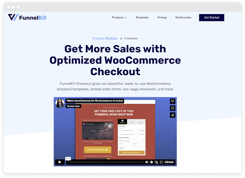
Try different types of visual content
Visual content will greatly enhance the engagement and memorability of your landing page. People are generally more drawn to visual content than plain text, which makes sense because it’s engaging and easier to process.
With this in mind, you should incorporate high-quality images that are relevant to your brand identity. Don’t be afraid to experiment with different placements, sizes, and styles to see what works best.
It’s also important to consider using videos to showcase your product or service in action or provide valuable information to your audience. Research shows that adding a well-made video to your landing page can boost conversions by a jaw-dropping 80%!
Infographics are another excellent option. These handy little visual tools are a great way to present data or complex information more engagingly and digestible. They are also far more likely to go viral than text-only content.
There are a ton of different ways to experiment with videos and photos on your landing pages. Here are some that have worked well for us:
- Before and after comparisons.
- Product demonstrations or tutorials.
- Customer success story videos.
- Animated explainer videos.
Remember to follow our previous tip and optimize your visual content so your site loads quickly and your videos and photos are ready for your audience.
Test social proof
Now, let’s talk about social proof. Put plainly, social proof is evidence that your business is trusted and respected by other people and businesses. Your audience is far more likely to take you seriously and engage with your landing page if you have social proof.
There’s a good chance you know exactly what we’re talking about. Think about this: if you are getting ready to buy a new pair of shoes on Amazon, do you choose the one that has 1,000 reviews or the one that has 5? In almost every case, people will choose the one with 1,000.
The reason behind this phenomenon isn’t hard to figure out. People are more likely to trust you if they see that others have had positive experiences with your product or service.
The absolute best form of social proof is user reviews. We found that 88% of people trust reviews over advertising. This means that your absolute best landing page won’t do as well as it should if there’s no evidence that other people have tried and enjoyed your product.
Now, let’s go through a quick list of types of social proof you can experiment with on your landing page:
- Impressive statistics (customers served, products sold, email subscribers).
- Case studies that discuss customer success stories.
- Noteworthy media mentions or press coverage.
- Social media feeds showcasing positive comments.
- Endorsements from industry experts or influencers.
- Trust badges from well-known companies like PayPal and McAfee.
We highly recommend experimenting with different types and placements of social proof to see which ones have the most noticeable impact on your conversion rates.
Optimize your call-to-action (CTA)
Your call to action is a crucial element of your landing page because it’s how you tell visitors what you want them to do next. This could be anything from signing up for a newsletter to making a purchase. Your specific CTAs will vary based on your industry and business goals.
A well-optimized CTA should be clear, concise, and compelling, using action-oriented language that inspires visitors to take the next step.
So, instead of using generic phrases like “Click Here,” opt for more specific and enticing language, such as:
- Get Started Now
- Schedule a Meeting
- Download Your Free Guide
- Claim Your Exclusive Discount
This simple shift in language will have a positive impact on conversions. But you’ll need to experiment so you can find what works best for your brand.
It’s also important to make sure your CTA stands out visually by using contrasting colors, larger buttons, or white space. You don’t want people to read your landing page but miss the CTA because it blends in.
You can test your CTAs beyond language, too. For example, you could try putting it above the fold so people can see it as soon as they land. Similarly, you could change the background color or directional cues to make it stand out from the rest of the page.
Your call-to-action will determine how many people engage with your site, so testing this element is one of the most important things you can do.
Try exit popups
Exit popups appear when a visitor intends to leave your landing page. It gives them one last opportunity to engage with your site before they go. While there’s no doubt that they can be effective, it’s crucial to use them strategically and respectfully. In other words, try to make them as least intrusive and disruptive as possible.
For the best results with exit popups, offer something truly valuable to the visitor, such as a discount code, free shipping, a limited-time offer, or a lead magnet like an ebook or checklist. Make sure the offer is relevant to their interests and aligns with the content they were browsing on your site, and there’s a pretty good chance they’ll take action.
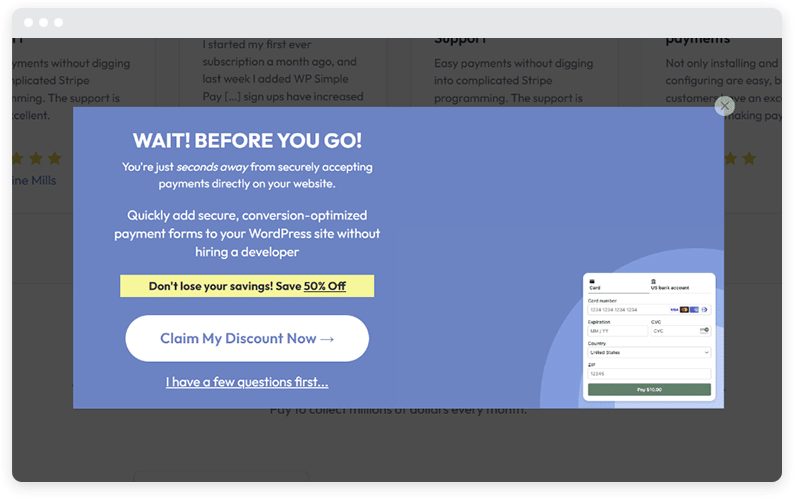
Here are some best practices to consider when you’re designing an exit popup for your site:
- Use engaging headlines that grab attention.
- Keep the design simple and stay focused on the offer.
- Include a clear and prominent CTA.
- Make it easy for visitors to close the popup if they’re not interested.
- Set a frequency cap to avoid showing the popup too often to the same visitor.
- A/B test different offers and designs to optimize performance.
Start testing your landing page today!
Testing your landing pages is an ongoing process. By regularly experimenting with different elements, you can gather data on what resonates with your visitors and make adjustments over time.
Even small changes will add up and will have an impact on your conversions and overall business growth.
Remember, what works for one business may not work for another, so it’s essential to test and optimize based on what makes your brand unique. By consistently testing and refining your landing pages, you’ll be well on your way to maximizing your conversions and taking your business to the next level.
More articles from us!
