11 interactive 404 pages to keep your audience engaged


Concerned you’re losing customers for mundane reasons? Let’s say a visitor makes a spelling mistake when they type in your web page. And, out of frustration, your potential customer gives up or decides to try again later, only to forget all about your brand. The answer? Interactive 404 pages.
This might be happening on your website right now. Instead of letting it continue, learn everything you need to know about creating and leveraging 404 pages.
What is a 404 page?
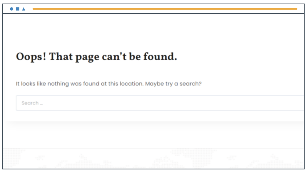
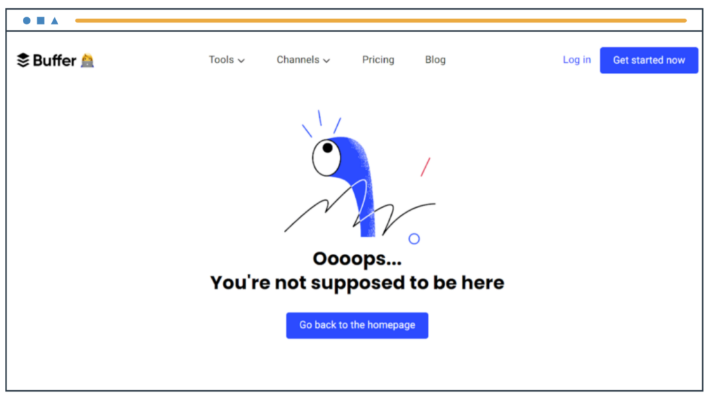
A 404 page is a code websites use to show people that the page they are trying to visit doesn’t exist.
Here’s an example:
So, what scenarios would result in someone landing on a 404 page? Here are some reasons:
- The site visitor mistyped the webpage (URL).
- The visitor clicked on a broken link.
- The user entered the URL from memory or bookmark, but the page has been deleted.
- URL structure has changed.
- A visitor lands on a URL for gated content, and they need to log in to access.
Usually, 404 pages are generic blank screens with a few words. But they also provide a powerful opportunity to engage your audience and boost your brand image even when a minor 404 error happens.
Spice up your 404 pages, or you will lose audience members for good instead of keeping them moving through your site.
In the following sections, you’ll learn how to create 404 pages and explore many useful examples.
How to easily create 404 pages
Creating an engaging 404 page can be a time-consuming task. But you can create them yourself if you build your content on WordPress.
WordPress is a Content Management System (CMS) allowing you to add content to your site easily. It’s the most popular CMS, and millions of businesses use it to create their sites.
However, even beginners with no coding skills can build websites on WordPress from scratch. What’s more, if you use blazingly fast EasyWP for your Managed WordPress Hosting, you can set up your site in minutes.
Once your WordPress site is ready, all you need is the SeedProd plugin to help you set up your 404 page in a flash. Just choose the 404 page setup and follow the step-by-step method to add graphics, text, and links.
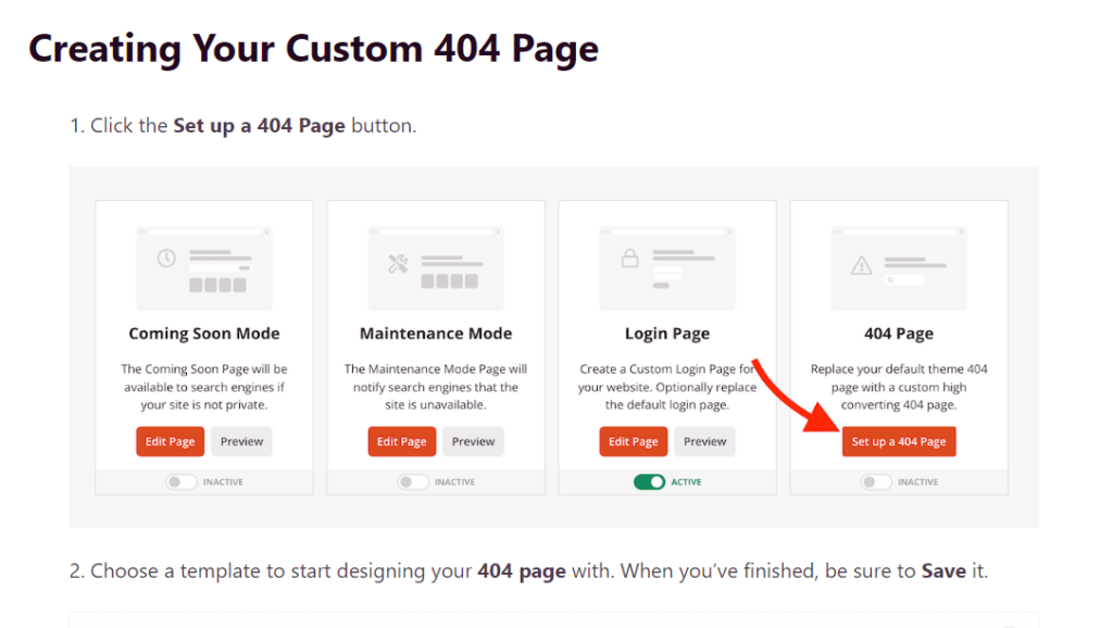
You can fully customize your 404 page to meet your branding standards and redirect your audience to the right page.
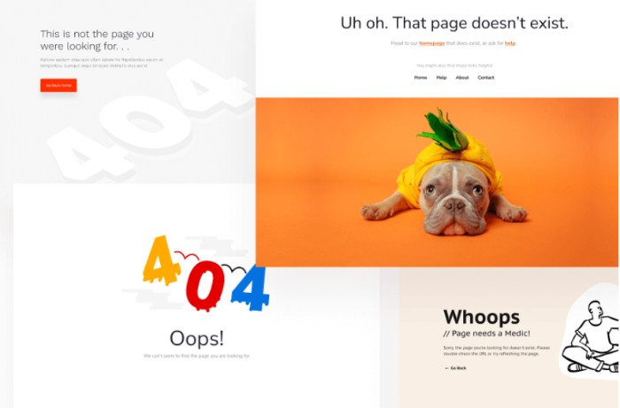
In this way, you can easily set up your 404 page and add more functionality to enhance user experience on your site.
11 ideas for interactive 404 pages (with examples)
Now that you understand 404 pages and how to make them, here are several examples of fantastic 404 pages from around the web. Use these examples to inspire your own 404 pages!
- Humor
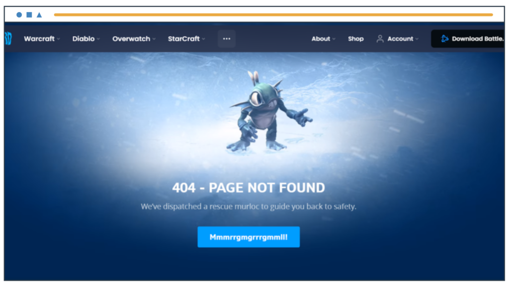
When a user lands on a 404 error page, there’s usually a sense of irritation. A funny image or joke can engage the user and surprise them by showcasing something humorous.
Check out this 404 page by Blizzard. The subheading and button are hilarious and make the user curious to see where the button will lead.
- Navigation links
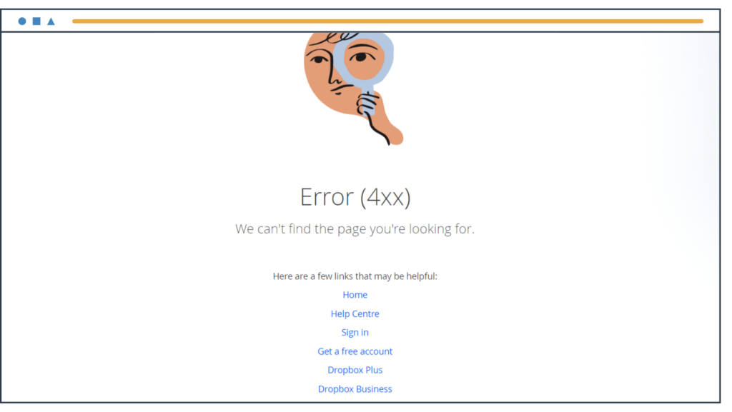
Send your user to the right page by adding navigation links or buttons. You can ask them to go to the home page, contact page, or other relevant site where they’ll find what they need.
Here, Dropbox provides links to its most popular pages or categories.
- Search bar
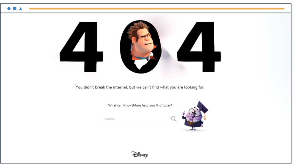
Adding a search bar is a clever way to give visitors the information they need. They’ll enter relevant keywords and find the right page with the desired information. The image below shows a cute animation with a search bar on Disney’s 404 page.
- Empathize
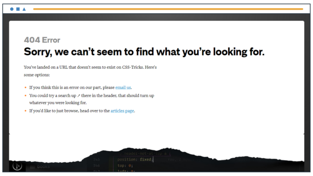
Show empathy and understanding for the visitor’s frustration. Just saying ‘sorry’ or a light-hearted ‘Oops’ will make people feel heard, and they’ll read the rest of your content to figure out what to do.
- Add a game or interactive element
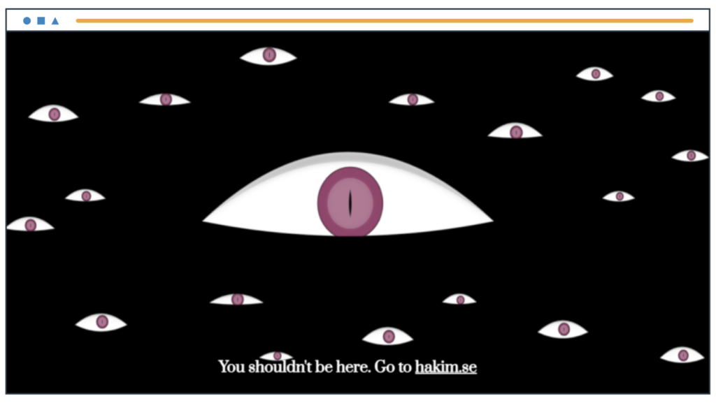
You can make your 404 pages fun and interesting while showcasing your abilities. This 404 page by designer Hakim El Hattab responds to mouse movements. The eyeballs in this graphic move along with the cursor.
If you run a graphic design or gaming company, this type of interactivity will showcase your skills and convince people to use your services.
- Video or animation
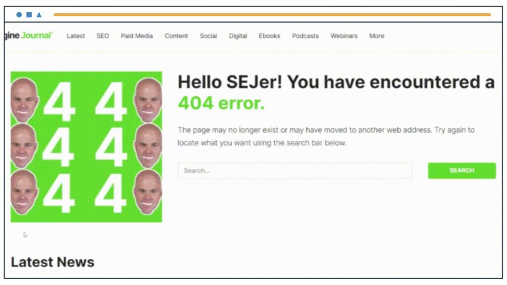
Use a video or animation to grab visitors’ attention. Check out this 404 page by Search Engine Journal.
It’s funny and makes you want to stare at the screen for a while. So, don’t be afraid to try using GIFs and videos in your error pages if it fits in with your brand identity.
- Custom illustration
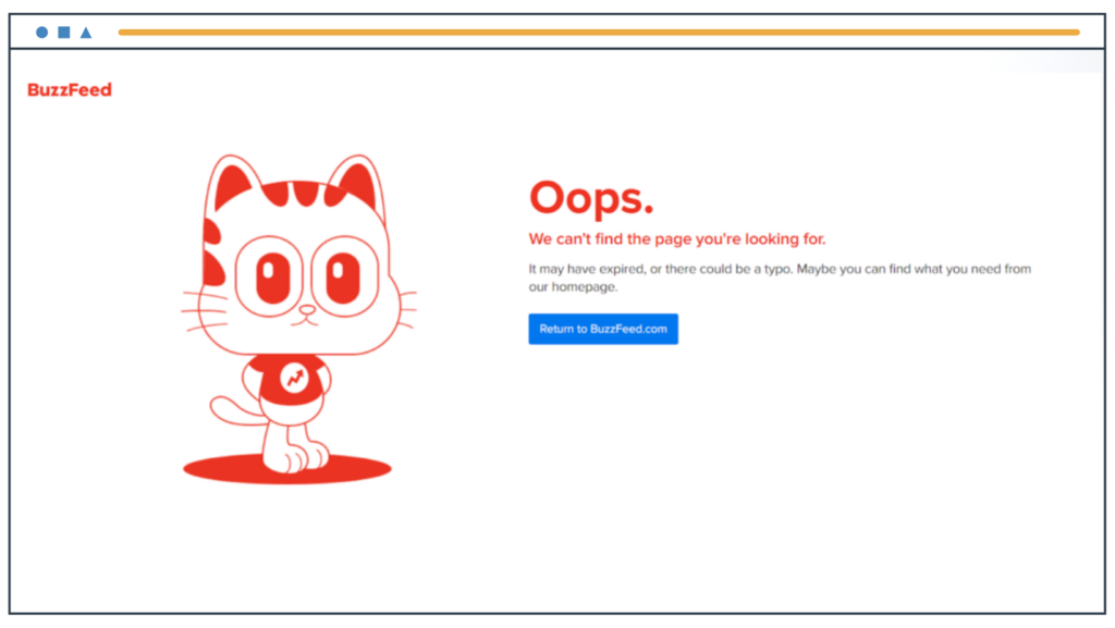
Use custom illustrations to showcase your brand’s personality. Make sure that you use your brand colors and craft a fun illustration that represents the tone of your business.
- Newsletter subscription
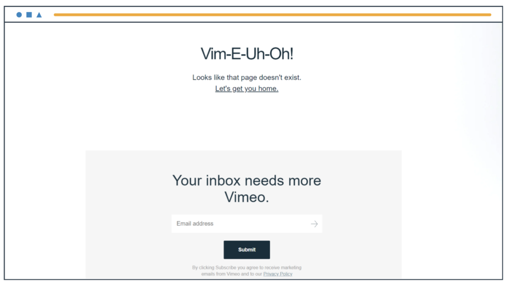
You should encourage users to sign-up for your email list as often as possible. This is true when people land on a 404 page too.
As the image below shows, Vimeo has a newsletter subscription option, part of its common footer. That’s one way to add a newsletter sign up invitation to your pages. You can also add an opt-in popup form or a sign-up form in the middle of the page.
- Social media links
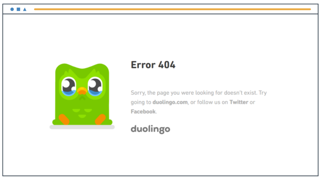
Adding links to social media on your 404 page is a great way to get people to check out your social media. Duolingo invites users to follow them on Twitter and Facebook when people land on an error page.
- Call-to-action
Calls-to-action (CTA) are important because they ‘command’ or direct people to take action. And you can often use this small but impactful technique to benefit your brand.
A simple button or link with a call-to-action like ‘Check out our latest offers’ or ‘Discover more recipes’ will lead to more engagement and increased conversion rates.
- Feature your blog content
If you run a blog where content is your most important asset, then you should constantly encourage users to read your blog posts.
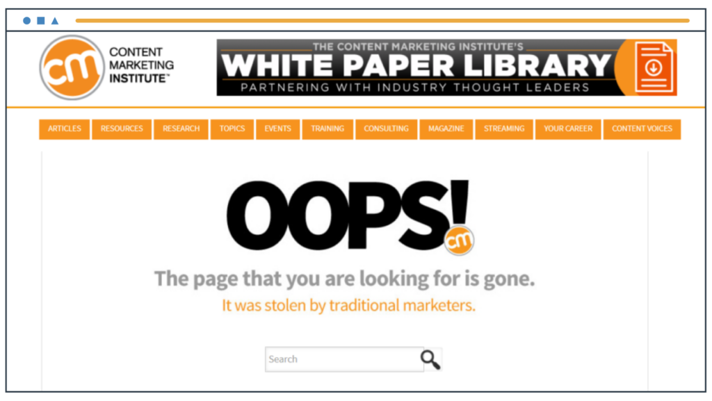
Check out Content Marketing Institute’s 404 page in the image below. They lead users to their pillar posts which provide information on their topic of expertise: content marketing.
Features of a successful 404 page
Now that we’ve looked at several awesome examples, let’s break down the elements and features of a successful 404 page.
Use visuals
Most of the 404 example pages in this post feature visual content, including custom graphics, animations, GIFs, or videos. And even the businesses that have only used text in their 404 pages have ensured they are attractive and dramatic. So, remember to make your own 404 error page visually appealing and impactful.
Be unique
The 404 page is the perfect place to showcase your brand personality. If you run a comical website, then include funny pictures or text. If you have a finance website, you’ll want to feature serious and professional content that highlights your trustworthiness and integrity. Stay true to your brand voice when creating a 404 page.
Customize the experience
Avoid using a generic blank-screen template for your 404 pages. Instead, feature some interactive experience or content that is unique to your products and services.
Several examples featured here only further the brand’s tone and style, so do the same for your website.
If it’s too complicated to make, you can hire a vue.js developer to develop an engaging and unique appearance that also may be clickable and entertaining.
Give people new places to go
Finally, add navigation links, a search bar, and social media buttons to your 404 pages. This will help visitors find the content they were looking for if they didn’t land on the right page. Additionally, you can also use this as an opportunity to attract more users by adding newsletter subscription forms, calls-to-action, or blog posts to keep people reading.
The point is that your user will continue their journey on your site instead of leaving it.
Boost your site speed
Site speed is a key factor in user experience, and it’s important to keep this in mind even for your 404 pages. When a user lands on a non-existent page, they expect to be redirected quickly to the correct page or at least be provided with helpful information or options.
However, if your 404 page takes forever to load, your site visitor is likely to get frustrated and quit altogether.
Again, this is where EasyWP’s Managed WordPress Hosting makes all the difference.
EasyWP is a powerful and reliable hosting solution designed to deliver fast page load times. Boost your user experience by ensuring that your 404 pages load quickly and reliably.
Make sure your visitors stick around for longer
When it comes to designing web content, user experience should always be a top priority. If visitors are met with a confusing and frustrating experience, they’re not going to stick around for long.
Broken links and dead ends are surefire ways to drive them away. That’s why it’s crucial to ensure your 404 pages (aka error pages) are attractive and informative.
Don’t leave your site visitors hanging — give them interactive elements and helpful tips on how to proceed. Create some killer 404 pages, your visitors will thank you for it!
Speaking of error pages, have you ever been concerned about your site being flagged as dangerous by Google? If so, discover how to resolve a “deceptive site ahead” warning on your website.

Syed Balkhi is the founder of WPBeginner, the largest free WordPress resource site. With over 10 years of experience, he’s the leading WordPress expert in the industry. You can learn more about Syed and his portfolio of companies by following him on his social media networks.
