15 Landing page examples that convert visitors to clients


Your landing page is the first impression of your company. The eye of the (company’s) soul, if you will. They’re like the front door of your business. The covers of your book, to be specific.
At this stage, you might be like, “Duh, I already know this information — this is why I’m on this blog!”
So, without any further anecdotes or overused idioms, here are the top landing page examples (of products and services alike) you can refer to.
Hopefully, these will help you convert your visitors into paying customers.
Example #1: Ahrefs
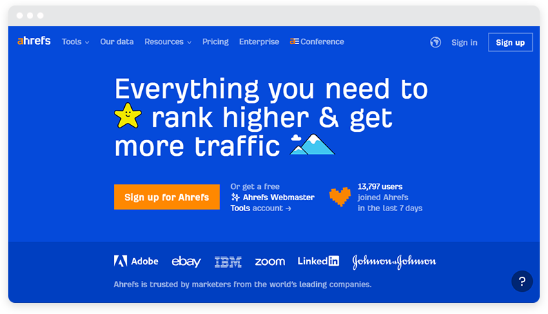
Ahrefs’ home page is clutter-free, straight to the point, and provides impressionable social proof (e.g., number of users and names of clients) — all of which make excellent landing page content.
The added cherry on top is the super-crisp one-liner, which encapsulates exactly what Ahrefs does. If you scroll further, you’ll notice the company provides readers with multiple product screenshots, data, social proof, and resources, which ultimately help build trust for prospective customers from the get-go.
Another thing that makes this a great type of landing page? Ahrefs has multiple CTAs (e.g., Sign Up, Watch Demo, and Get Started) on the same web page to encourage different actions for different readers.
Example #2: ClickUp
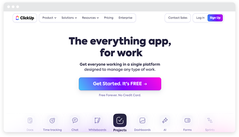
Like Ahrefs, ClickUp delivers a powerful and punchy one-line that sums up precisely what the software does. Moreover, to drive the point home, they’ve also provided icons of things they can help with (e.g., projects, forms, time tracking, etc.).
They also:
- Provide plenty of social proof (e.g., ratings, reviews, and client names)
- Enlist data to make an impact (e.g., “Trusted by over 2 million teams”)
- Showcase product screenshots
- Have multiple CTA options
Example #3: WordPress.com
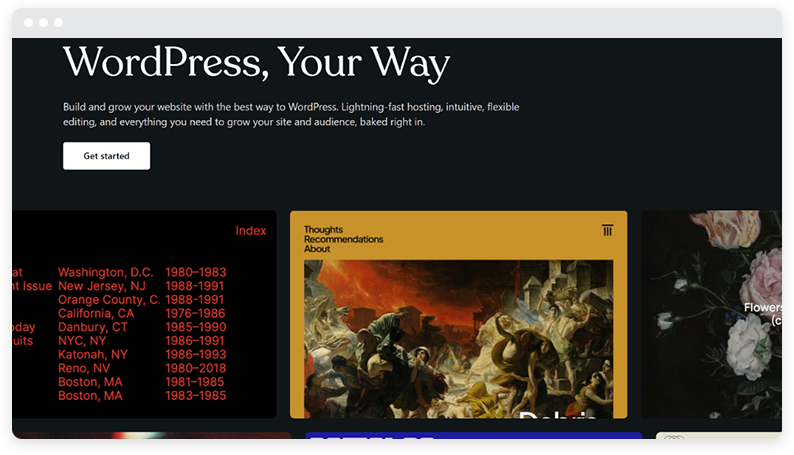
We may be a company that helps manage WordPress sites, but we promise we’re not playing favorites here.
WordPress’ landing page is impactful on its own merit simply because it’s minimalistic, clutter-free, provides tons of product-led examples and even has abundant social proof.
However, what truly makes WordPress impactful is its interactive elements. For example, you can access these details by clicking on an example, finding if a domain name is available, etc.
Example #4: SoFi
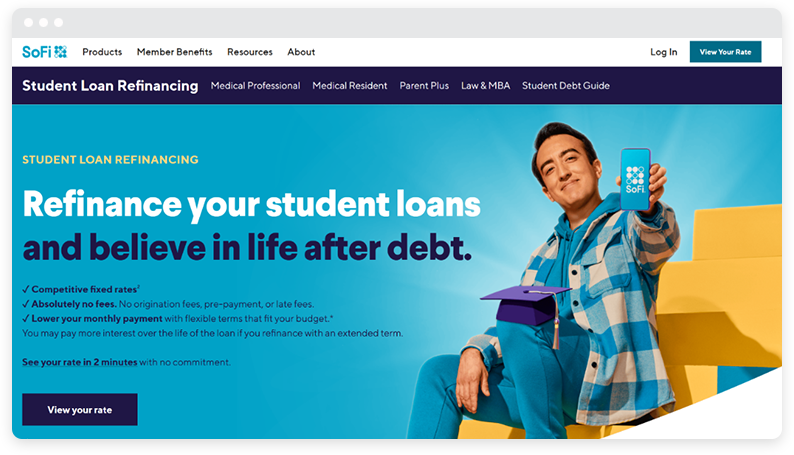
When you visit SoFi’s student loan refinancing page, you’re immediately drawn in by its clean and user-friendly design. This landing page is an excellent example of how to convert visitors into clients through a strategic layout and compelling content.
First, the page greets you with a clear and concise headline: “Refinance Your Student Loans.” This instantly communicates the page’s purpose and assures you that you’re in the right place.
Beneath the headline, a prominent call-to-action (CTA) button, “View My Rate,” stands out, inviting you to take the first step towards refinancing.
The page also uses visual aids effectively. You’ll notice a simple yet appealing design that includes icons and illustrations to break down complex information into digestible segments. This approach keeps you engaged and makes the content easier to understand.
Another standout feature is the use of testimonials and success stories.
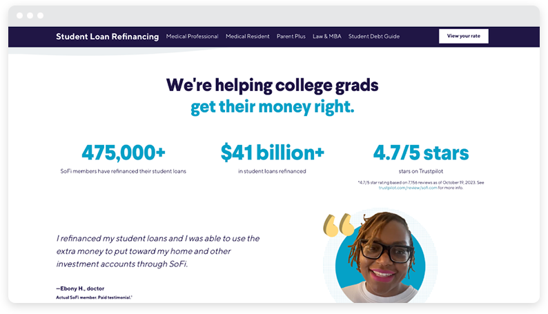
By showcasing real-life examples of how other users have benefited from SoFi’s services, the page builds trust and credibility. You can easily see yourself achieving similar success, which motivates you to proceed with the application.
Example #5: The Aurit Center
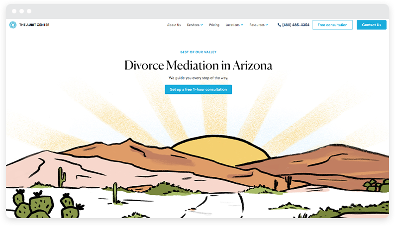
Aurit Mediation’s landing page is perfectly designed to convert visitors into clients by highlighting its free one-hour consultation offer. It effectively communicates the benefits of divorce mediation while emphasizing the value of the initial free consultation.
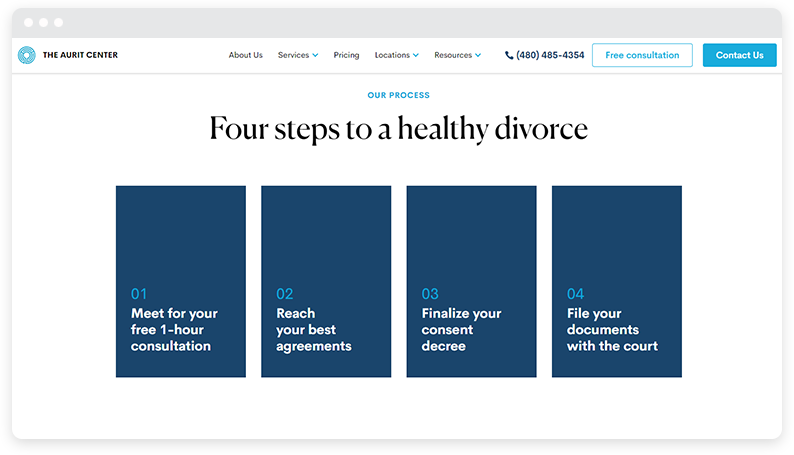
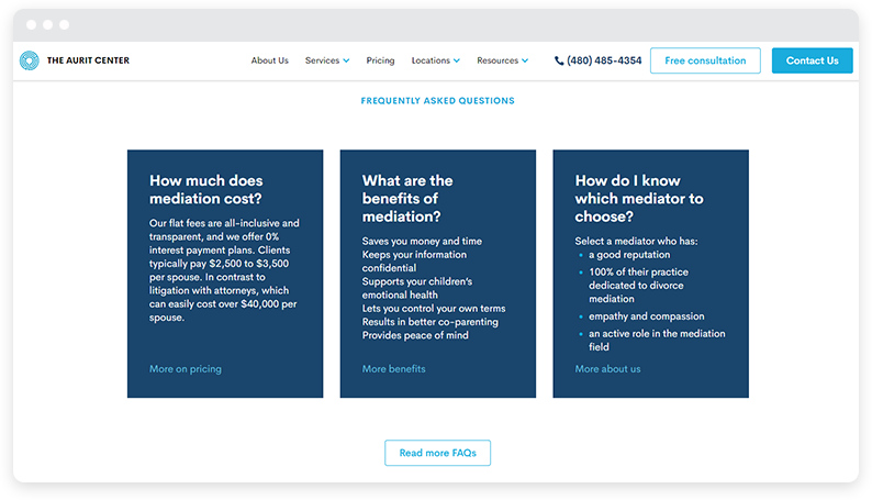
Just below the fold, the page clearly outlines the process and describes the mediators’ credentials. This builds trust and reduces barriers to engagement.
A free consultation is a powerful call to action. It encourages visitors to take the first step towards resolving their disputes amicably and:
- Demonstrates the service’s commitment to client welfare
- Provides potential clients with a risk-free opportunity to experience the benefits of mediation
- Increases the likelihood of conversion from visitors to long-term clients
Example #6: Wise
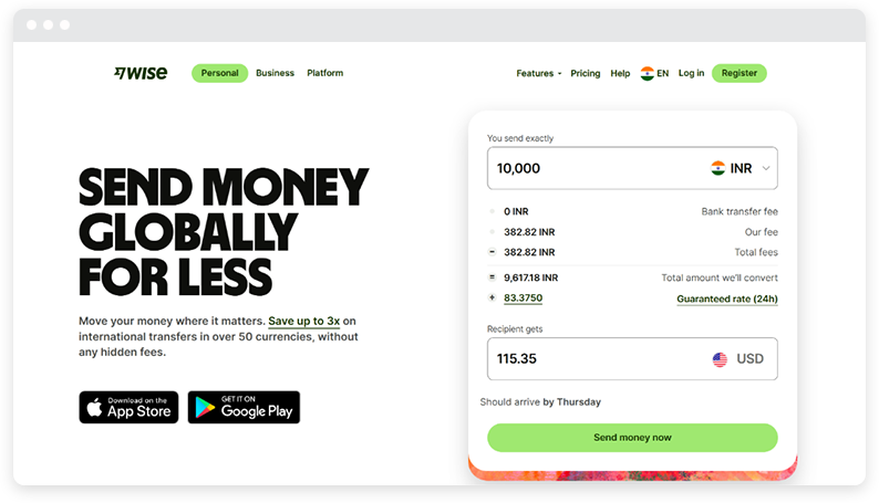
Wise knows its USP — being able to provide a reasonable rate on international transfers—and that’s exactly what it highlights through its copy and visuals, making its website’s home page an excellent place to land.
To highlight its added benefits, the home page also showcases the countries Wise operates in, the security benefits it offers, and the customers (from different countries) it has benefitted.
Example #7: Astra
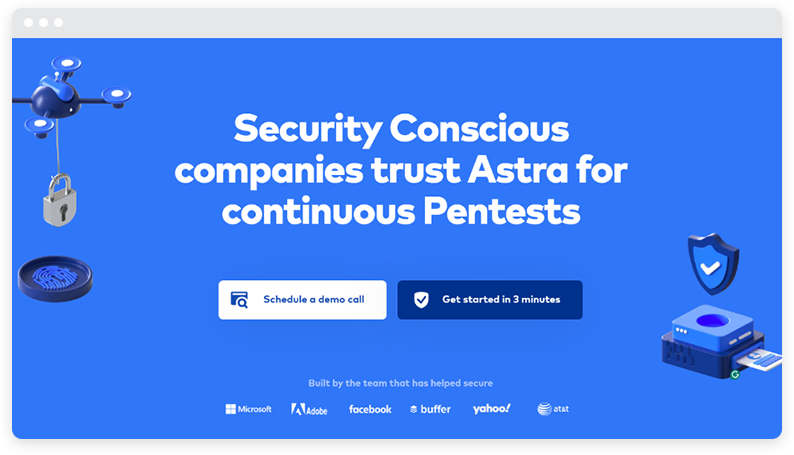
Data security companies like Astra don’t have time for theatrics, which is why Astra’s landing page is super-direct, showcases the essential CTAs from the get-go, and provides social proof (e.g., customer reviews, client names, ratings, etc.) to help customers make an informed purchase.
They also increase trust by having an interactive product demo on their page, showing multiple security elements, and being transparent vis-a-vis what they can do for you regarding security.
Example #8: Reliable Couriers
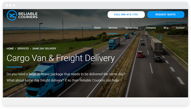
Nowadays people are relying more on their phones to look for products and services, so it’s essential to make your landing page responsive and appealing on all devices.
Let’s take a look at Reliable Couriers’ freight courier service and what it looks like both from a computer and a phone.
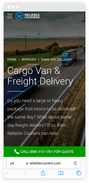
You can see that the simple layout is present in both versions, respecting their brand colors and copy, and call buttons are easy to tap on all devices.
Example #9: Goby
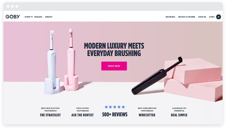
Goby’s home page is a winner because it not only tells you they’re a modern luxury brand, but their visuals and overall landing page layout also signify they’re a modern luxury brand.
Kudos to them for using the right designs, fonts, and colors on this dedicated landing page!
They also adhere to other best practices, such as showcasing user reviews and ratings, emphasizing the CTA, and being transparent about their processes.
Example #10: Zapier
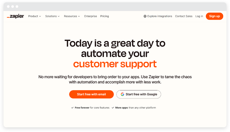
Zapier’s landing page is clean, minimal, and clear about the value proposition it offers — being able to automate every part of your business.
If you scroll further down, you’ll notice Zapier has a list of client names, interactive elements that show how the brand works, use cases it caters to, tons of social proof, and lots more!
Aka, its landing page is a perfect 10/10. Why? You can start free with your email address. And the design elements are on point.
Example #11: Demand Curve
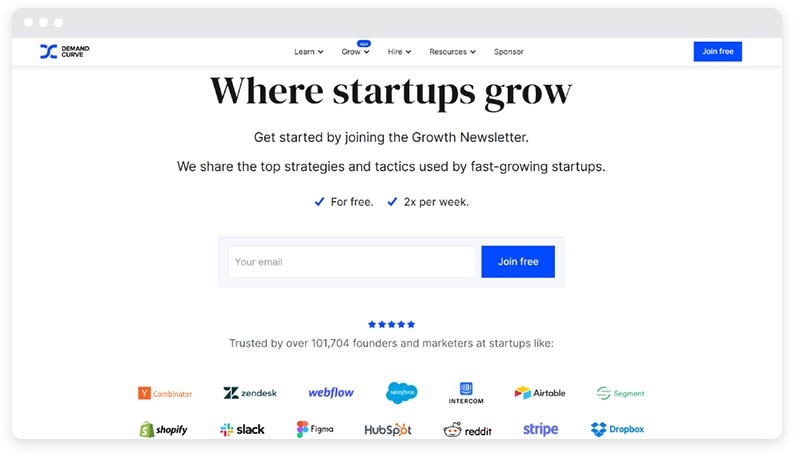
Demand Curve’s landing page may be without all the bells and whistles, but it’s proof that even simple and sweet landing pages can do wonders.
The company focuses on using clear language, gaining trust through social proof, and providing readers with critical need-to-know info (e.g., the price of the newsletter, how many times they’ll view it, and who it is for).
Once you scroll down, you’ll find more content that helps you realize what a great investment Demand Curve can be for your business.
But again, the author chooses to use simple, jargon-free language instead of vague, braggy statements, which allows the reader to understand exactly what Demand Curve does without having to undergo a session of mental aerobics.
Example #12: Duolingo
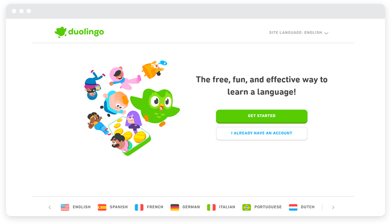
Duolingo, our favorite owl, has an impressive landing page that can teach us a thing or two. For starters, like Demand Curve, Duolingo chooses to go through the clear, simple, and clutter-free approach.
To make the user experience better, they also provide the option to change the site language, showcase all benefits they can provide, and are clear about what languages they offer to teach.
Example #13: Beaches of Normandy
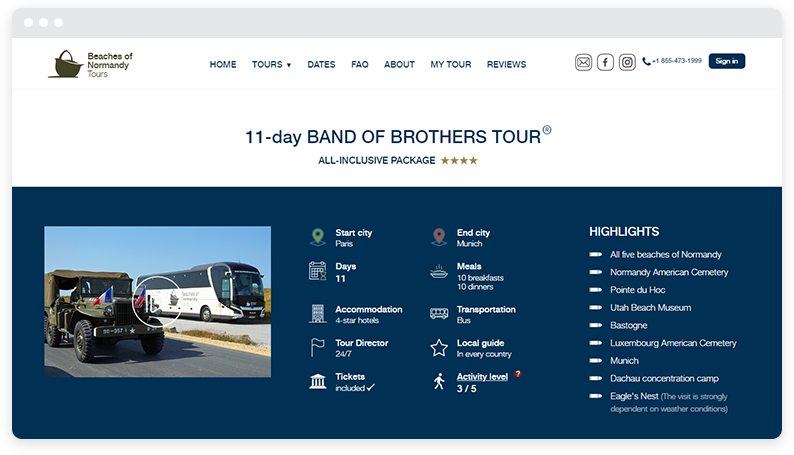
Detailed and engaging storytelling is great for converting visitors into clients, and Beaches of Normandy Tours knows about this. Their Band of Brothers experience immerses visitors in the historical context and unique experiences, transporting them to the heart of Normandy’s history.
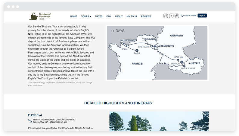
The page captivates potential customers and sparks their interest in booking the tour by providing rich descriptions, vivid imagery, and personal anecdotes.
Example #14: Comfee
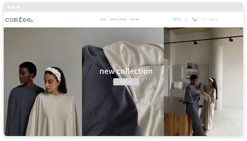
Comfee’s landing page stands out from the rest because it heavily relies on visual experiences to help customers envision how they feel once they purchase their product.
Aside from showcasing its models wearing their clothing in different settings (e.g., at home, at the souk, while strolling the streets, etc.), it also uses a clutter-free and minimalistic layout to reduce user cognitive load.
Example #15: Tasty
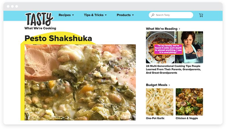
Unlike other brands on the list who opted for a clean, laid-back approach, Tasty is quite the opposite. Instead, it uses tons of colors to create a fun and relaxed vibe that engages visitors to its site.
Considering Tasty is a food brand, it can choose this approach as opposed to, say, a security brand, newsletter, or comfort clothing collection.
However, just like others, it also engages in other best practices, such as:
- Relying on simple, easy-to-read content
- Having visual experiences on their site
- Showcasing user reviews
Get your own landing page on a list like this
If you’re ready to be featured in a list like this with your own landing page, the first step would be to get your site ready and your landing pages published!
If you’re a WordPress site, we can help with the following steps — hosting your site. Here’s why you might find our service helpful:
- Our website loading speed is less than 0.7 seconds
- You can easily back up your site at any time!
- We provide free SSL security & CDN on all plans
If you’re interested, take a look at our website and learn more about the benefits we can offer!
Are you ready to boost conversion rates thanks to effective landing pages? Your time has come. Opt for a landing page builder or landing page template, and you’ll have high-converting landing pages in no time.
Here’s to your success with your next digital marketing strategy!
About the author

Guillaume is a digital marketer focused on handling the outreach strategy at uSERP and content management at Wordable. Outside of work, he enjoys his expat life in sunny Mexico, reading books, wandering around and catching the latest shows on TV.
More articles from us!
