Design news: composition rules & free fonts


Welcome to this week’s roundup, where we explore the latest trends and advancements in the world of WordPress design. In this edition, we’ll delve into three key topics that are making waves in the WordPress design community: the exciting advancements in visual elements for WordPress-powered websites, the golden rules of composition that every web designer should follow, and a curated selection of amazing and free web fonts that can elevate your design projects to the next level.
The future of WordPress development technologies
WordPress has come a long way from its humble beginnings as a blogging tool and has become a crucial platform for millions of websites across various industries. As the digital landscape continues to evolve, so does WordPress. The platform is constantly adapting to meet the changing demands of web development.
RS Web Solutions recently published an article about the exciting advancements have been made in visual elements for WordPress-powered websites. Features like video backgrounds and parallax scrolling effects have opened up new possibilities for captivating user experiences. Minimalistic themes offer easy-to-design and manageable templates that enhance content readability and ensure compatibility across devices. The utilization of white space creates a visually appealing and uncluttered experience for visitors.

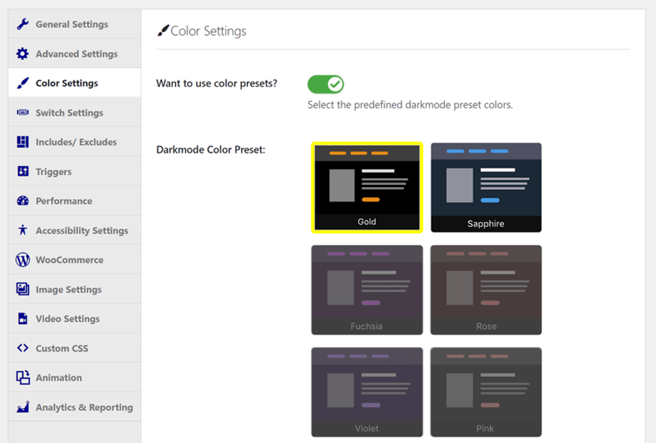
Image source: Themeisle
Another notable development is the introduction of Dark Mode UI, which provides a visually pleasing design with darker backgrounds and brighter colored text. This customization benefits users with visual impairments and contributes to power conservation. Furthermore, accessibility has become a key focus in WordPress development. Voice recognition technology is being implemented to enable users to navigate websites and search for content using input devices such as microphones.
The golden rules of composition for web designers
Composition is a crucial aspect of graphic design that goes beyond just visual appeal. It involves arranging elements and content in a way that is both aesthetically pleasing and informative to users. To achieve this, according to MakeUseOf, there are several golden rules of composition that web designers should follow.
One of the most important rules they mention is to design a grid layout. Using a grid provides consistency and helps guide the audience’s eye through the design. The Fibonacci Spiral is one example of a layout guide, but other grid sizes can work just as well.
Giving everything space is another key rule. Negative space and appropriate spacing between elements allow users to absorb the information without feeling overwhelmed. Working to a grid can help ensure proper spacing, and prioritizing design elements helps determine what is necessary for the composition.
Amazing (and free) web fonts
Finding the best free web fonts can be a daunting task, but Creative Bloq has done the legwork for you. While there are many paid options available, they recently rounded up their top picks for free web fonts that are both visually appealing and functional. Here are a few of the most versatile recommendations:
Fjalla One. A medium contrast display sans serif font that can be used in various sizes. With its beautiful design, it’s no wonder it’s featured on over 410,000 websites. Available from Google Fonts.
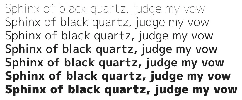
M Plus 1p. A sophisticated and relaxed font that comes in seven weights. This free Google Font aims to be crisp and sleek while maintaining a sense of elegance.

Example image of M Plus 1p source: Creative Bloq
Do Hyeon. Takes inspiration from old hand-cut vinyl letters and offers a unique Latin and Korean split font. Another Google Font selection, it even selects the right consonant for its adjacent vowel, making it visually interesting.
Ostrich Sans. Available from The League of Moveable Type, this is a modern sans-serif font with a variety of styles and weights. Its long neck adds a touch of uniqueness to any design.
Lora. With its calligraphy-inspired curves, this Google Font brings a more artistic feel to web designs.
Incorporating these free web fonts into your designs can elevate your website’s aesthetics while maintaining readability and functionality, thanks to Creative Bloq’s curated selection.
We hope you found this read enjoyable and informative. Why not explore other editions of our weekly WordPress design roundup? Each edition features the latest trends, tips, and inspiration for designing a stunning WordPress website. Happy designing!
