This week in WordPress design — improved aesthetics, Wix AI, and a new admin concept


Welcome to our latest roundup of essential news for WordPress designers. Learn ten stellar design tips that could instantly improve the aesthetics of your WordPress site, covering everything from hover effects to the power of well-placed iconography. Then, get a recap of Wix’s announcement regarding its new AI Site Generator. And dive into the proposed admin UI revamp by WordPress, examining its potential benefits and the excitement it has sparked within the developer community.
10 ways to aesthetically improve your WordPress site
If you’re looking to spice up your WordPress site and make it more visually appealing, MakeUseOf recently published ten design tips you can consider. First and foremost, remember that less is usually more when it comes to design. That being said, hover effects and smooth animations can add some interactivity and style to your site.
You can also use jump links to navigate lengthy sections without having to wait for a new page to load. Integrating social media feeds into your site can foster a sense of trust with visitors, and parallax scrolling and video backgrounds can create a unique 3D-like effect. Be sure to use these features sparingly though, as too many can slow down your site’s performance.
The article also reminds us that call-to-action buttons are crucial for guiding visitors toward particular actions, such as subscribing to a newsletter or requesting a quote. And incorporating iconography into your site can help convey information more quickly and easily for all users. Check out the complete list of elements to help strike the balance between functionality and aesthetics.
AI to replace WordPress?
Wix, the well-known website builder, has announced that it will soon be offering an AI Site Generator feature that allows users to create entire websites by simply typing a description into a box and answering a few follow-up questions. The Verge reports that the AI and algorithms will then generate everything from design to text and images automatically. This new feature goes beyond templates and uses a mix of ChatGPT and Wix’s own tools to create unique websites. The process is shown in a video where the user specifies the purpose of the website, provides some details about their business, selects a fitness trainer image, and clicks “Generate Site.” Will this mean trouble for WordPress?
The resulting website is certainly impressive and far more professional-looking than anything previously created with Wix. However, it’s unclear how much direct control users have over aspects of the site, such as its appearance. Also, while Wix’s AI-generated content looks good on this hypothetical website, it’s unknown how accurate it will be for each user’s specific needs. Finally, it’s unclear who is responsible if someone sues over content generated by Wix’s AI Site Generator, as Wix’s burden to bear is only stated for “Artificial Design Intelligence (ADI)-generated content.” While it seems logical that something similar will soon appear for WordPress, there is no news yet on what Automattic has in the works.
WordPress plans to revamp its admin user interface
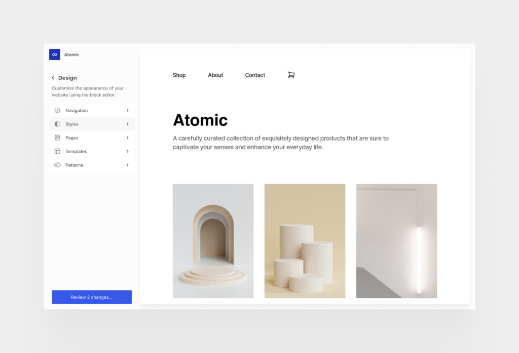
WordPress is planning to revamp its admin user interface (UI) as part of its Phase 3: Collaboration roadmap. The aim of the work is to improve the overall experience by giving plugins and users more control over the navigation. According to WP Tavern, the proposed plans have energized the developer community, who are hoping the revamp will solve several long-standing problems with the interface.

Image source: WP Tavern
One recurring theme in the feedback was the need to curb the pollution of top-level menus and the out-of-control admin notices. Another challenge concerns ensuring the new design adequately accommodates WordPress sites with large numbers of posts, pages, categories, menus, comments, and other things that can overwhelm a UI that was intended to be simplified. Developers are optimistic about the project and have reacted positively to the concepts shared. Having a standard set of UI components would make things easier for developers who are extending WordPress rather than building their own UI in the admin.
We hope you found this read enjoyable and informative. If so, we encourage you to explore other editions of our weekly WordPress design roundup. Each edition features the latest trends, tips, and inspiration for designing a stunning WordPress website. Happy designing!
